Doors: a shared minimum padding and gap for framed boxes
What changes for visitors
Panels, cards and disclosures that sat too close to their own text or to the box next to them now have at least 16 px of room. Visitors will notice this on:
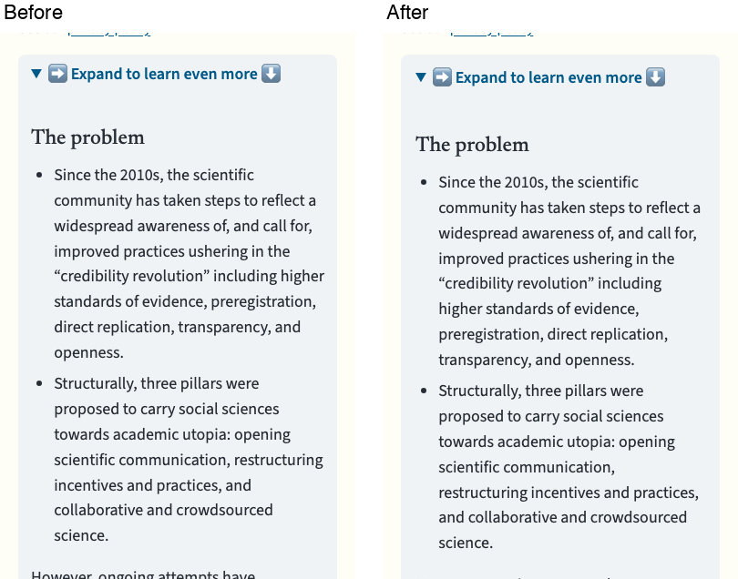
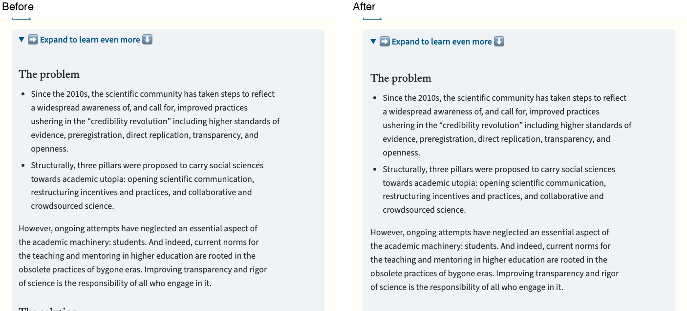
- the "Expand to learn more" disclosures on /about/, /neurodiversity/ and other section pages;
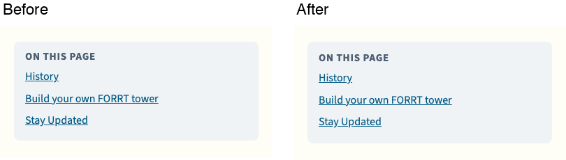
- the phone "On this page" box;
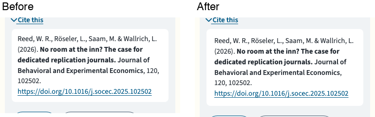
- the citation boxes on /publications/;
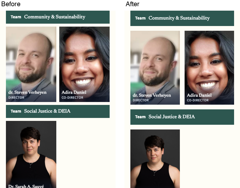
- the steering committee page on phones, where the cards and team names were 10 px apart and each team's name sat as close to the team above as to its own people;
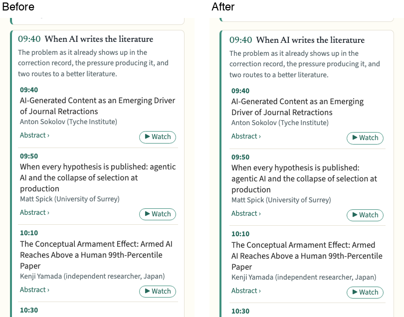
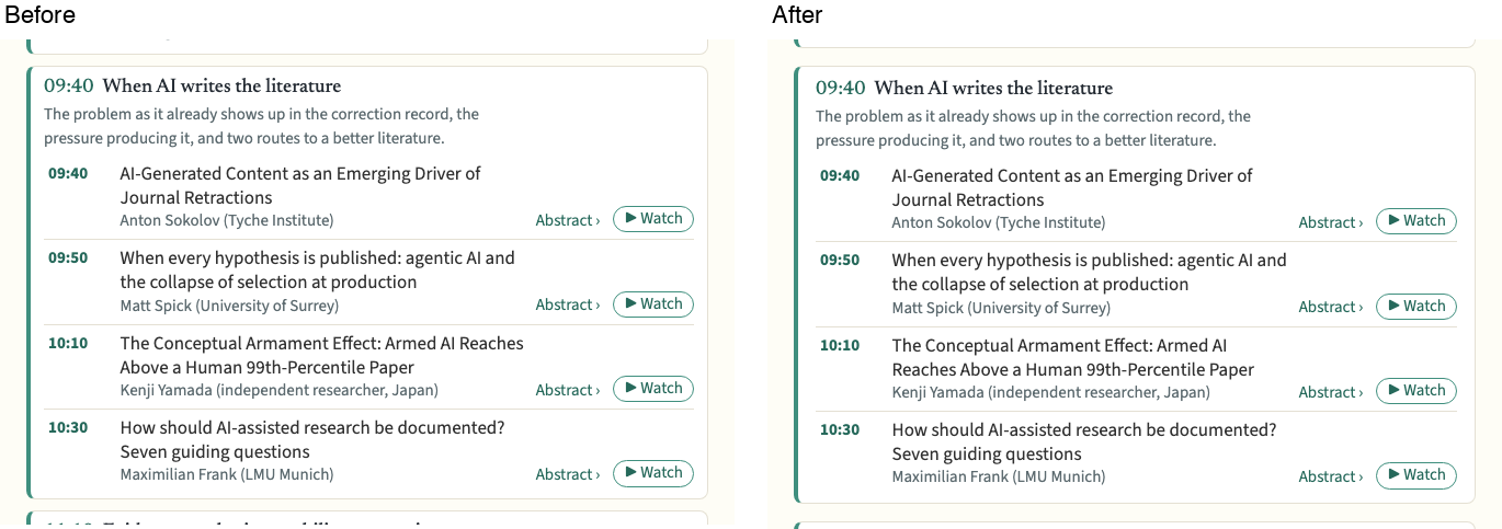
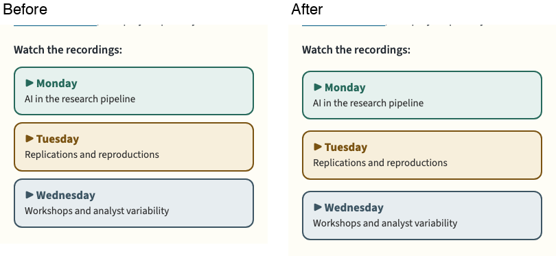
- the AI metascience programme sessions and the "Watch the recordings" links.
The differences are a few pixels per box. The cause was that each component set its own padding and gap (8, 10 or 12 px), with no shared minimum.
The shared default
tokens.css gets three spacing tokens for framed boxes (anything with its own fill or border):
--box-pad:16px;    /* least space between a box's edge and its text */
--box-pad-y:14px;  /* top and bottom of a one-line bar, such as a disclosure's summary */
--box-gap:16px;    /* least space between two boxes */
The components the audit flagged now use them. The comment in tokens.css says a component may use more space but never less, and that small controls, chips and joined groups (tabs, segmented controls) are exempt.
Before and after
Disclosures (/about/us/), 390 and 1440 px
Phone "On this page" box (/about/us/), 390 px. It shows only on phones.
Citation box (/publications/, "Cite this" open), 390 and 1440 px

Steering committee (/about/steering-committee/): the grid at 390 px, and the team name band at 1440 px, where only its padding changes

AI metascience programme session (/ai-metascience/), 390 and 1440 px
AI metascience recording links, 390 and 1440 px

How the problems were found
A scratch Playwright audit (not committed) checked about 100 pages: one of each template family plus every section page. It ran at 390 and 1440 px, and the main 24 pages also at 1024 px. A second pass opened the phone menu, the mega menu, search, the resources filter drawer and a glossary popover. The audit treats a box as framed if it has its own fill, a border on at least three sides, or a shadow. It reported:
- pairs of framed boxes less than 12 px apart, side by side or one above the other;
- framed boxes with text less than 12 px from their edge.
Every hit was checked against a screenshot.
Left alone, as deliberate or not a defect:
- Inline pills and chips inside running text.
- Rows and grids of small controls or chips (under 48 px tall) with gaps of 6 px or more, such as resource filter chips, publication pills, tag clouds, home topics and Replication Hub stage links. Their inner padding was judged against 4 px top and bottom and 8 px at the sides, not 12.
- Touching siblings of the same kind (joined groups), and the AI metascience day tabs.
- The action-card "bricks" on /submit/, /about/get-involved/ and the Replication Hub, which are 5 px apart.
article.csssays they are "laid edge to edge like a short wall". - Steering committee photo cards, whose photo fills the card to its edge.
- The line-clamped glossary hub cards, the scrolling term-finder list, the contributor network's panel and canvas, fieldset legends, Leaflet map controls, the booklet viewer and the chatbot. The audit counted text cut off or scrolling inside these as being "past the edge"; none is visible in the screenshots.
- The resources search box and its two selects, 8 to 10 px apart, which read as one control group.
Not changed here, because #1137 owns the files (clusters.css, lists.css, layouts/partials/clusters/):
- On /clusters/, /clusters/cluster-1/ and /disciplines/ at 390 px, the "Navigate clusters and sub-clusters" button touches the first cluster card (0 px), and the cluster card's text sits about 11 px from its left edge.
- The /clusters/ topic tiles at 390 px are 6 to 10 px apart.
- The /newsletters/ archive cards (
.nla-grid,lists.css) are 10 px apart.
/clusters/cluster-1/ and /disciplines/ were not touched: none of the changed selectors matches them.
Decisions to review
- 16 px as the minimum for both inner padding and the gap between boxes, with 14 px top and bottom for one-line bars. Most Doors cards already use 16 to 24 px, so this raises only the outliers. A value of 12 px would have met the audit's threshold but still looked tight next to the larger cards.
- Small controls are exempt. Buttons, chips and pills keep their own compact padding and gaps (6 to 8 px); the tokens are for blocks.
- Steering committee on phones: each team's name band now has an extra 16 px above it (32 px from the team before), so it groups with its own people. Desktop is unchanged apart from the band's padding.
- The AI metascience page's CSS is in its Markdown (
content/ai-metascience/index.md). It is hand-written, not generated, so it was edited there to use the tokens. - No new automated check, as agreed for this phase.
Checks
python3 scripts/check_seo_html.py: passedpython3 -m unittest discover -s scripts/tests: 145 tests, OKpython3 scripts/rebrand/check_design.py: fails with the same 4 failures asrebrand-doorsbefore this change: lines of 80 characters or more on two Arabic glossary terms (العلم_المفتوح and the digital object identifier term) at 1024 and 1440 px. Nothing new- The scratch audit after the change: no framed box in the changed components is under 12 px, by either measure.
🤖 Generated with Claude Code
Summary by cubic
Adds shared spacing tokens so framed boxes—cards, panels, disclosures, and bars with their own fill or border—keep at least 16 px between their edge and text, and at least 16 px between boxes. Panels, citations, disclosures, and the phone contents box that previously used 8–12 px now meet this minimum.
The new --box-pad, --box-pad-y, and --box-gap tokens in tokens.css are the single source for this minimum. Small controls and chips are exempt, as are joined groups like tabs. Applied the tokens to disclosures, the phone contents box, publication citations, steering committee cards (desktop unchanged), and the AI metascience programme sessions and recording links. The steering committee grid on phones now adds an extra 16 px above each team name so it groups with its own people.
Decision points
- 16 px was chosen over 12 px because most Doors cards already use 16–24 px, so 12 px would still look tight next to them.
- The AI metascience page CSS lives in its Markdown content, so it was edited there directly.
- No new automated check was added for this phase.