Cluster pages: the diagram as the way in, linked reading lists, one colour per cluster
The cluster pages had become hard to use for reaching a resource. Sol and Opus scored them 6 and 4 in the first round under the design guide (#1135). The problems they found:
- The titles in a cluster's reading lists weren't links. Reaching a paper meant a citation button, then a pop-up.
- Nothing on
/clusters/linked to the eleven cluster pages. - The diagram's labels were about 9 px.
- The filters took half of a phone screen.
- The 258-item topic lists had no search.
- The clusters took turns using the four area colours.
What changes for visitors:
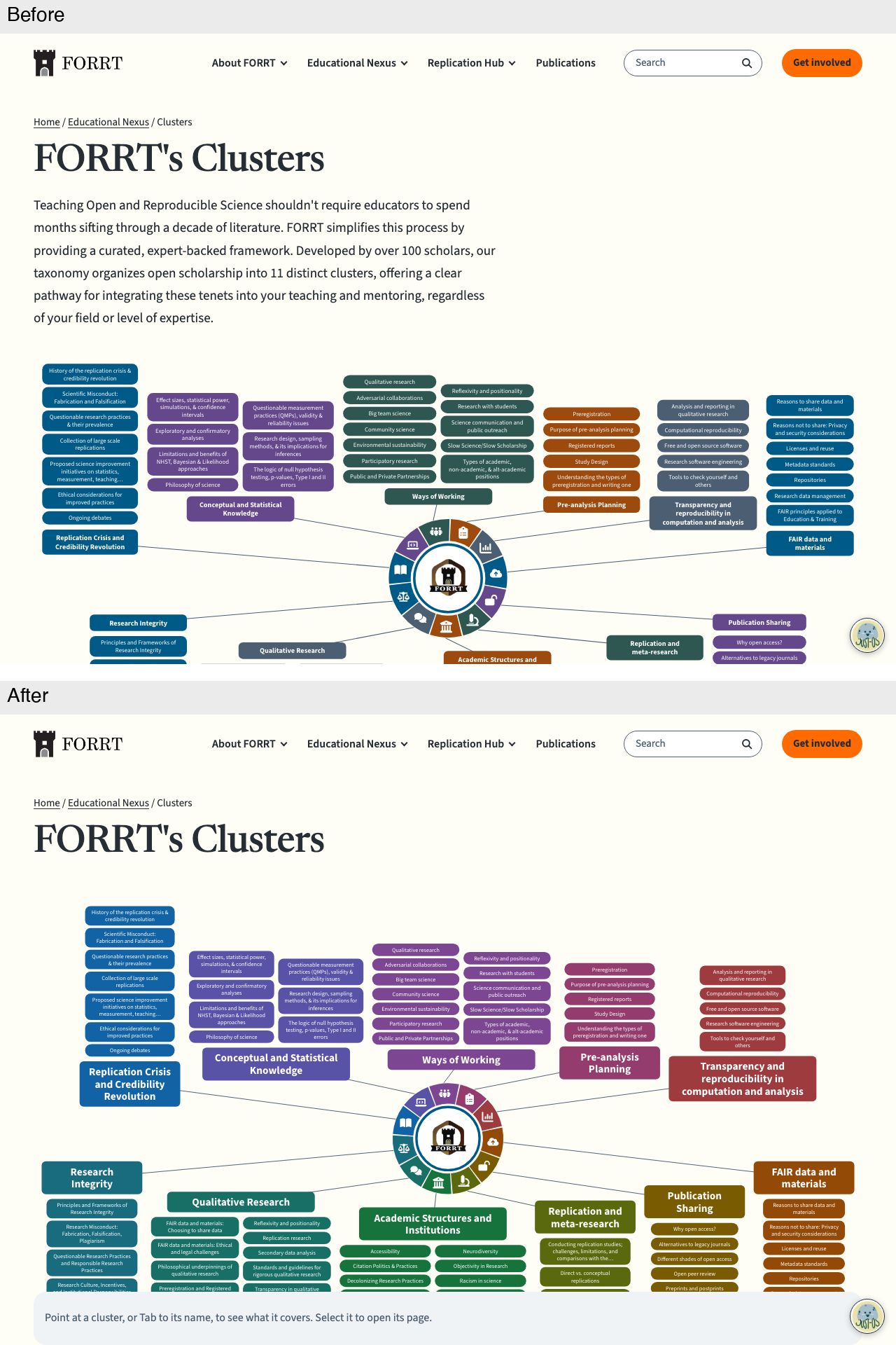
- The diagram is the way in on desktop. Each cluster name in it links to its cluster page and can be reached with Tab. Pointing at a cluster, or tabbing to it, highlights it and shows its name, first sentence and counts in a bar at the foot of the window. Cluster names are now about 16 px at 1440 px. Below 1256 px the names would be too small, so the page shows the small hub and a linked list, as on phones; "Open full size" still gives the whole drawing.
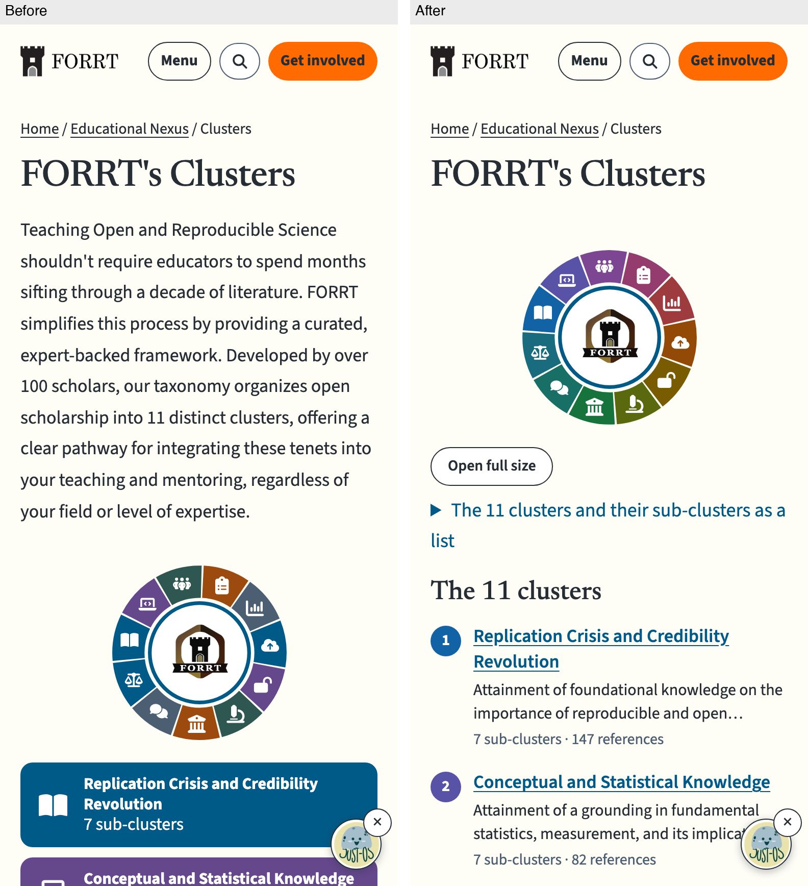
- "The 11 clusters" is a list of links to each cluster page, each numbered in its colour. On phones it replaces the eleven full-width coloured bars. Each cluster's heading further down also links to its page.
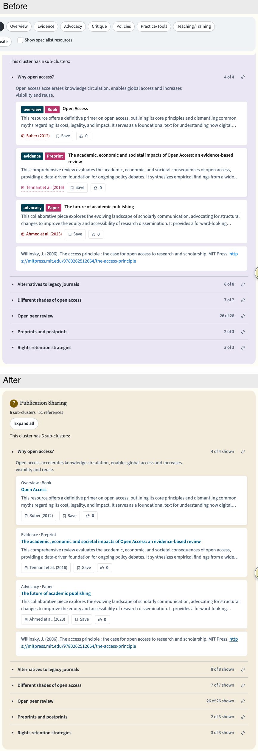
- Titles in reading lists link to the resource. The author–year button still opens the citation pop-up. "Overview · Paper" is plain text instead of teal and magenta chips, also in the pop-up.
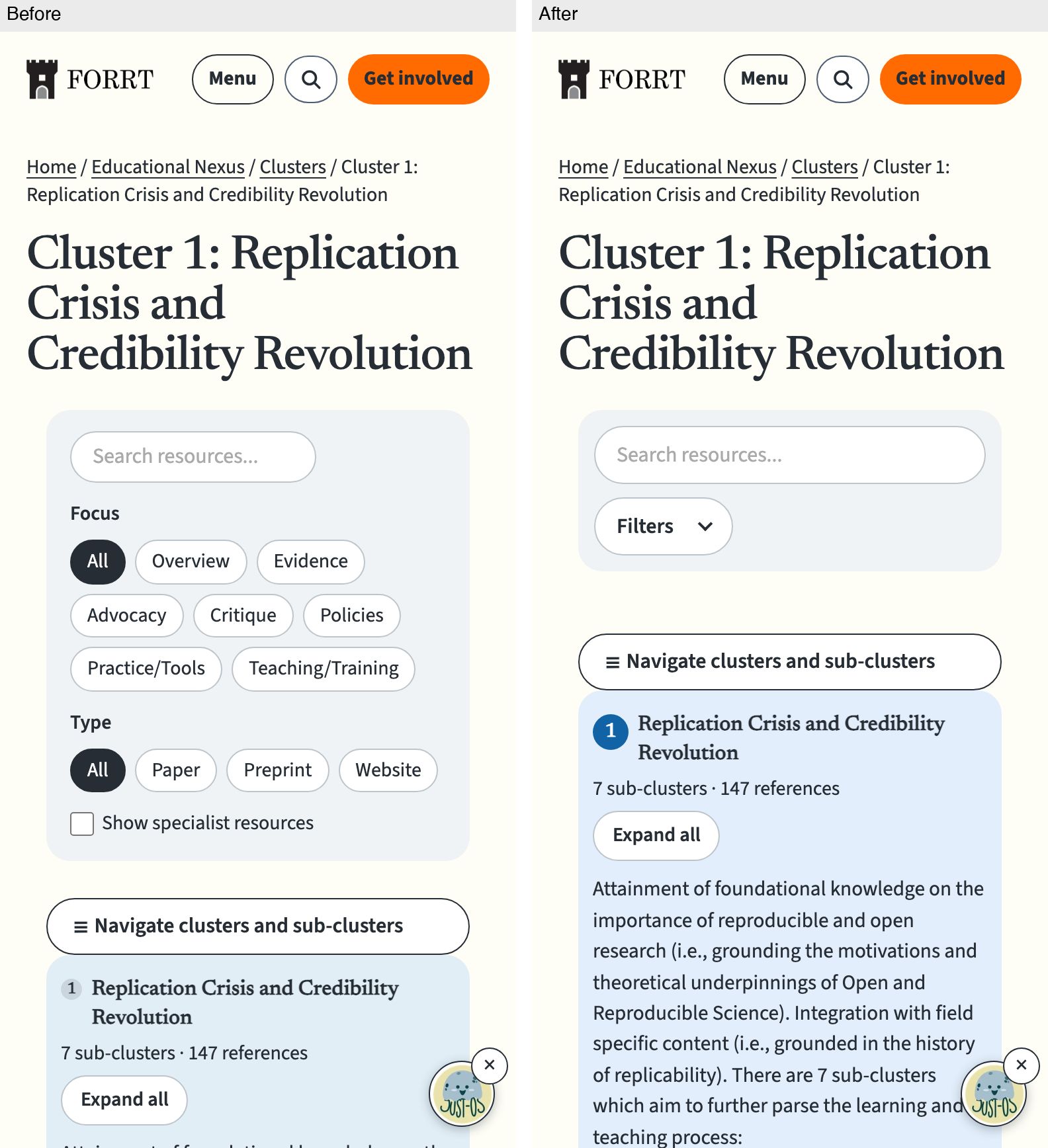
- Filters on phones sit behind a closed "Filters" button that counts the active filters. Buttons and search are 44 px tall on touch screens.
- Feedback when filtering: if a filter leaves nothing, the page says "No resources match" and offers Clear filters. Counts read "25 of 27 shown", and the specialist checkbox says those resources stay hidden until it is ticked.
- The citation pop-up takes keyboard focus, keeps Tab inside, and returns focus when closed.
- Topic lists (
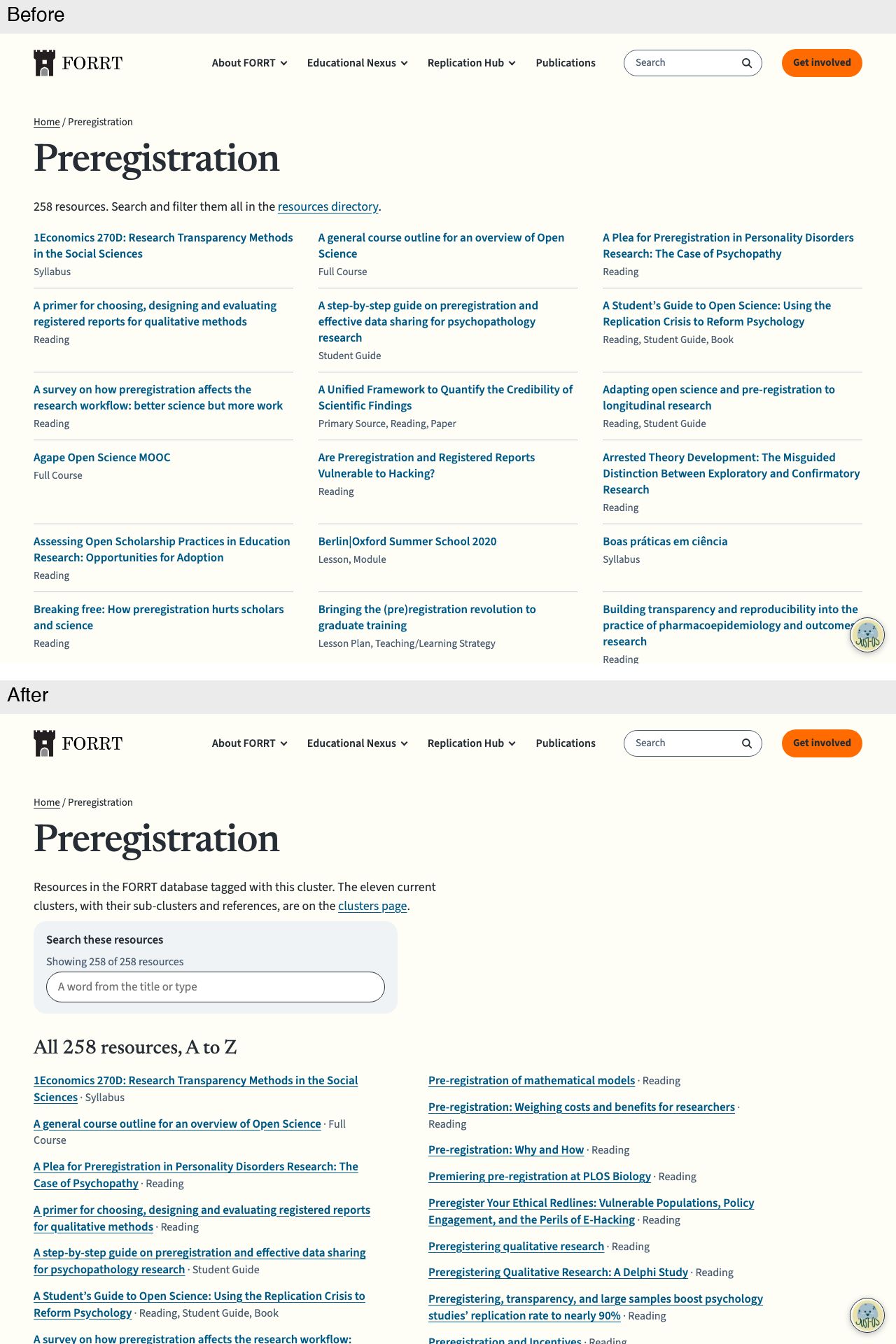
/forrt_clusters/<term>/) get a one-line explanation, a search with a live count, and underlined titles in two columns on wide screens. - The desktop side list underlines cluster names, marks the current cluster, scrolls it into view, and shows shadows where the list scrolls.
- Colours: each cluster has its own colour, together spanning the spectrum (
--cl1…--cl11intokens.css). The diagram, panels, side list and numbers all use them. The strong colours meet 4.5:1 contrast against the page.
Decisions to review
- Diagram for keyboard users: the cluster names in the diagram are real Tab stops, named "Cluster N: name". The ring segments and sub-cluster boxes are hidden from screen readers, because the text list repeats them. A separate list as the keyboard route scrolled the diagram off screen, so the highlight didn't work. Check 21 in
check_seo_html.pyand its tests now require named Tab stops instead of a hidden diagram. - The introduction ("Teaching Open and Reproducible Science shouldn't require…") moves below the diagram and the list, under "About the clusters".
- Colours:
- clusters 9 to 11 look fairly similar;
- the pale backgrounds of clusters 6 and 7 read close to beige, which the guide rules out. The existing community background is already close to that.
- The sub-cluster boxes in the diagram are still about 9 px at 1440 px. They are in the text list and the full-size view.
- Search drop-down on cluster pages is removed, because it counted differently from the filtered list.
/disciplines/keeps it. - Topic lists can't link to a pre-filtered resources directory. They use the older cluster names, and the directory filters by the current eleven.
- Resource titles open doi.org in a new tab without saying so. The guide asks links leaving the site to say where they go; this is for a follow-up.
- The share image
content/clusters/FORRT_Clusters.webpis re-rendered withscripts/render_clusters_share_image.py, because the diagram changed.
Checks:
check_seo_html.pypasses, including the rewritten check 21 and the FLoRA check.- The source rules and the unit tests (146) pass.
- The cluster parts of
check_design.pypass: the clusters diagram, specialist resources, panel width, floating controls, 200% text and phone reading. - axe finds only the site-wide skip-link "region" note.
- The page audit is clean on the cluster pages and
/forrt_clusters/preregistration/, apart from issues that were already there: a hidden 11.6 px count, and small badges on/disciplines/.
Overview, desktop: the diagram leads. It is in the cluster colours, with larger names, and a bar at the foot shows the pointed cluster.
Overview, phone: a small hub, then a linked list of the eleven clusters instead of full-width coloured bars
Cluster page, phone: search plus a closed "Filters" button instead of the full filter panel
Reading list, desktop: linked titles, plain "Overview · Book" labels, "4 of 4 shown", and the cluster's own colour
Topic list, desktop: an explanation, search with a count, and underlined titles in two columns
Created with Claude Opus 5.5 in Claude Code; reviewed by GPT-6.1 Sol and Claude Opus 5.5.
🤖 Generated with Claude Code
Summary by cubic
Overhauls the cluster pages so reaching a resource takes a single click: the diagram on /clusters/ links to every cluster page, each reading-list title opens its paper, and the filters collapse on phones. Each of the 11 clusters also gets its own colour across the spectrum (--cl1–--cl11 in tokens.css), replacing the rotation of the four area colours.
Navigation
- Cluster names in the diagram link to their pages and are tab stops (named "Cluster N: name"); pointing at or tabbing to one highlights the cluster and describes it in a bar at the foot of the window. Names read at about 16 px at a 1440 px viewport; below 1256 px the page shows the hub and a linked list instead, with "Open full size" still available.
/clusters/gains "The 11 clusters", a numbered linked list that also replaces the full-width coloured bars on phones; each cluster's heading further down links to its page.- The side list underlines cluster names, marks the current cluster, and opens scrolled to it; shadows at the list's edges show when it scrolls. The introduction moves below the diagram and list, under "About the clusters".
Resources, filters and feedback
- Reading-list titles are underlined links to the resource's DOI; the author–year button still opens the citation. "Overview · Paper" reads as quiet sentence-case text instead of teal-and-magenta chips, in the cards and in the citation pop-up, which now keeps focus inside and returns it to the opening button when closed.
- On phones the Focus, Type and specialist controls sit behind a closed "Filters" button that counts the active filters; search, buttons and checkboxes are 44 px tall on touch screens.
- Filtering reports "X of Y resources shown" and "No resources match" with a Clear filters button when nothing does; the search drop-down on cluster pages is gone because it counted differently from the filtered list (
/disciplines/keeps it). /forrt_clusters/<term>/pages get an explanation, a search with a live count, and underlined titles in two columns on wide screens.- Owner decisions to review: clusters 9–11 read fairly similar, and the pale backgrounds of 6 and 7 sit close to beige, which the design guide rules out. Resource titles open doi.org in a new tab without announcing it; that is flagged as a follow-up.