Resource entries: button in the first screen, shorter creator lists, linked clusters
Resource entries are the site's largest page family (1,473 pages), and often the page people land on from search. In the first round under the new design guide (#1135), Sol and Opus scored them 7 and 6. The main problems they found:
- A resource with many creators pushed "Open this resource" more than a screen down on a phone.
- The button didn't say it leaves forrt.org.
- The cluster was plain text, not a link.
- Phones showed the details twice.
- On desktop the details card came before the title in reading order.
What changes for visitors:
- Long creator lists show six names and then "and N more", which opens the full list. Every name stays on the page.
- The main button shows an external-link icon and the destination site beside it, such as "youtube.com" or "doi.org".
- The cluster in the details card links to its cluster page. This applies to 1,445 resources. The 10 resources with only old cluster names keep them as text.
- The type label ("Video", "Reading") is plain text instead of a grey chip, because the guide keeps pills for controls.
- On phones, the details appear once, after the keywords and before Previous and Next. The "Type" row is dropped there, because the label above the title already shows it.
- On desktop, the title and content come first in the page's reading order. The details card still sits in the left column.
Decisions to review
- The "and N more" disclosure appears only when a resource has more than seven creators, so it never says "and 1 more".
- The links to forrt.org (about 30 resources) show the site name but no external-link icon.
- Not changed, though the reviewers suggested them:
- Breadcrumbs: the same pattern runs site-wide.
- Previous and Next: they could be replaced with related resources, a larger change for a later PR.
- A citation block: no resource has a stored reference, and 835 of 1,486 have a DOI.
Checks: check_seo_html.py and the source rules pass, and the unit tests pass. The page audit (overflow, text under 15 px, contrast, line length) is clean on the four sample pages at 390 and 1440 px. CI runs the full design check and axe.
Based on rebrand-doors, which now includes the latest main.
199 creators, phone: six names, then "and 96 more". The button is now in the first screen, with its destination beside it. (This build lists 102 creators, so the disclosure says 96 more.)
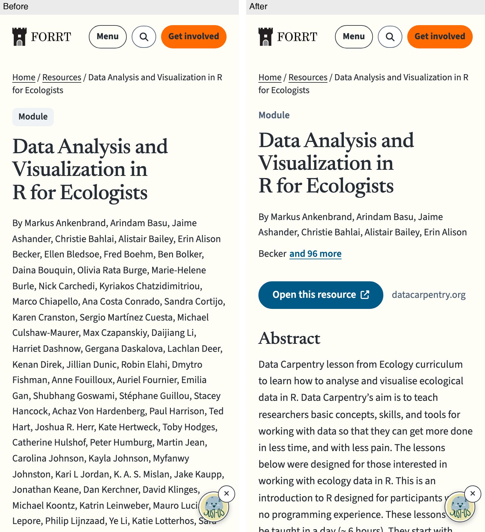
199 creators, desktop
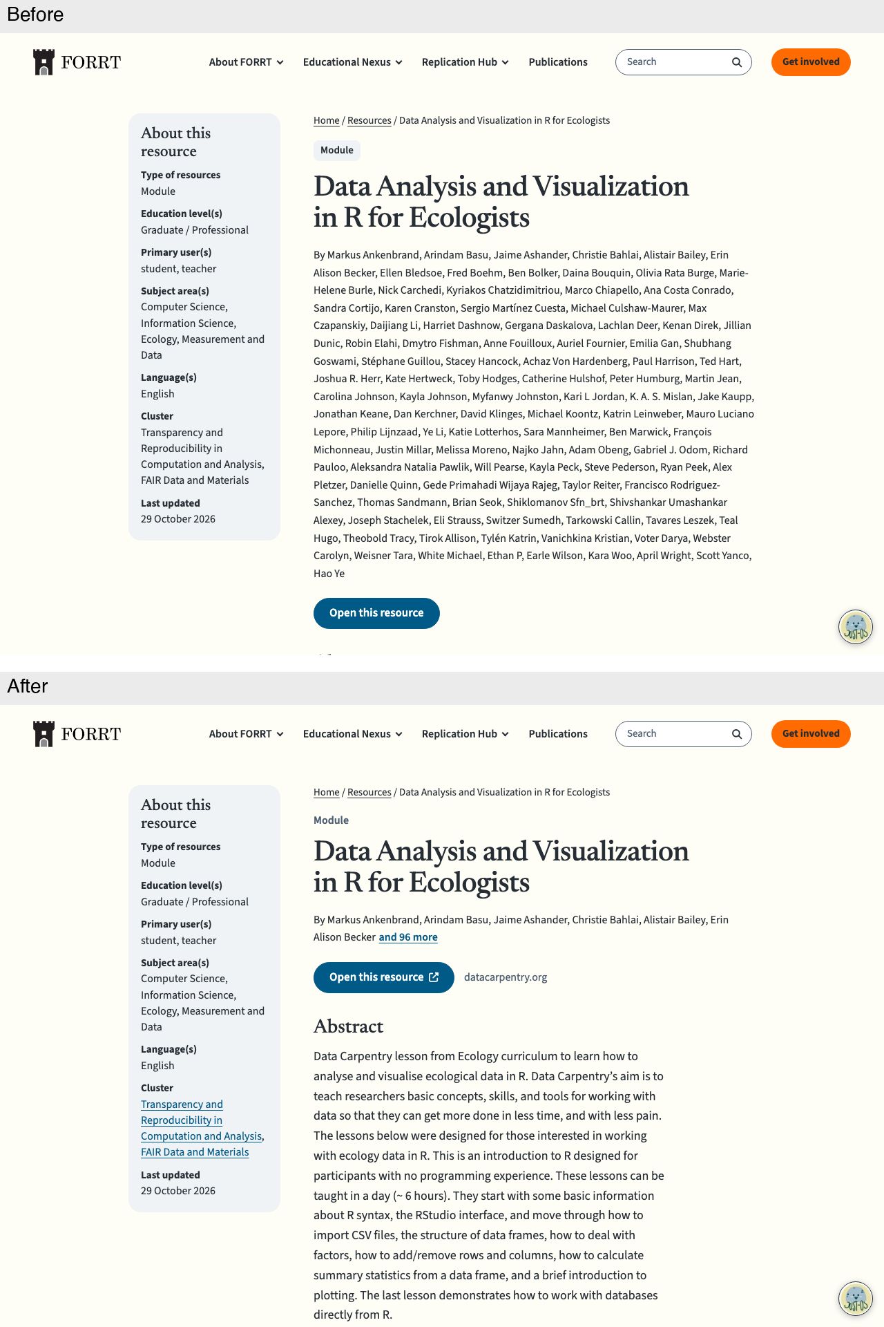
Short entry, phone: a plain type label, the destination beside the button, and one details card before Previous and Next instead of a summary line plus the card
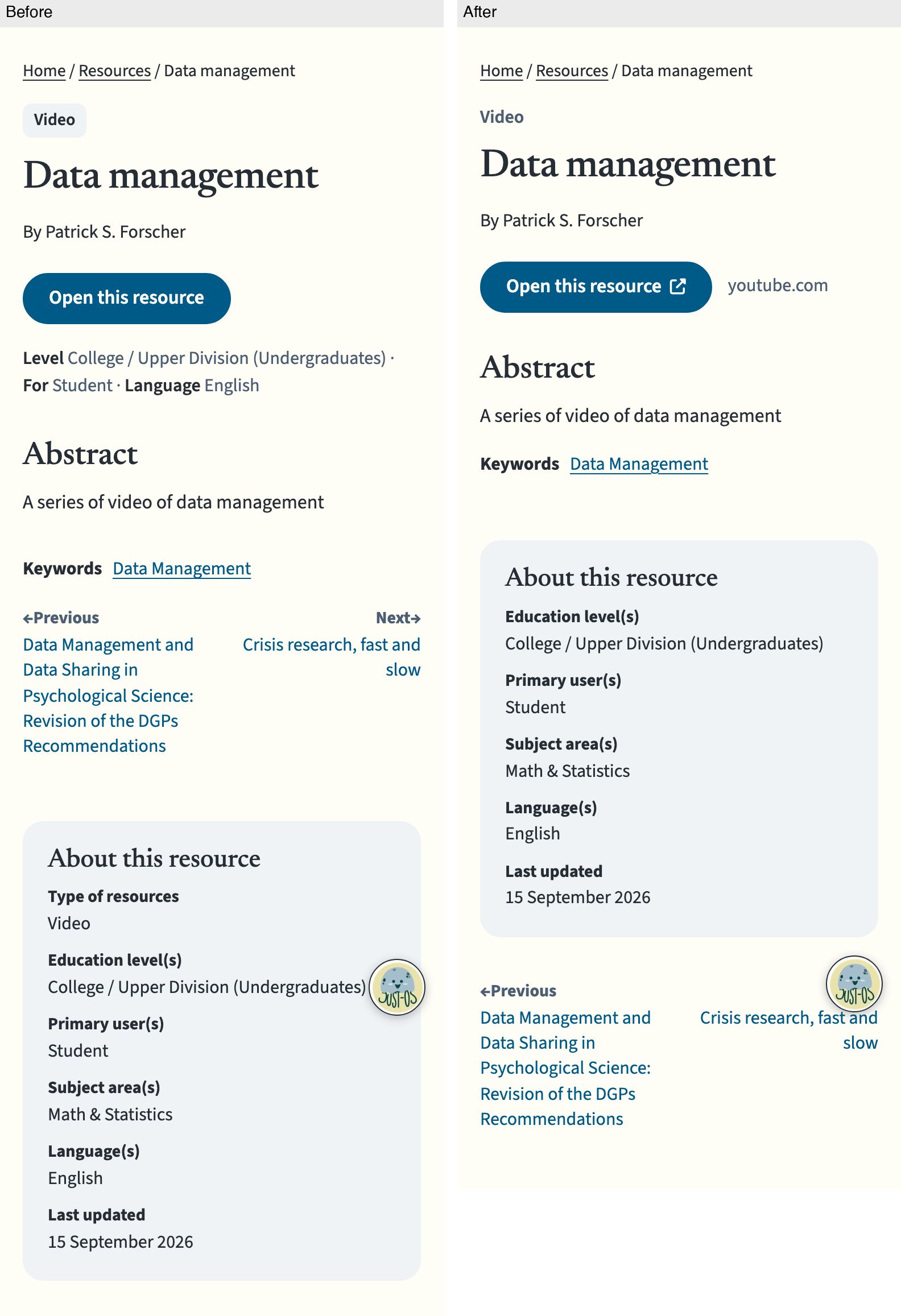
Short entry, desktop: a plain type label and the destination beside the button
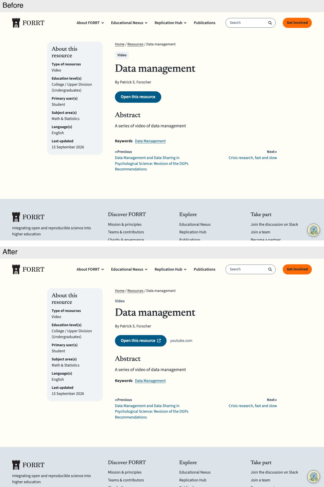
Details card, desktop: the cluster links to its cluster page

Created with Claude Opus 5.5 in Claude Code; reviewed by GPT-6.1 Sol and Claude Opus 5.5.
🤖 Generated with Claude Code
Summary by cubic
Reworks resource entry pages so the main button stays in the first phone screen and reading order puts the entry before the details card.
- Long creator lists show six names and "and N more" to reveal the rest, so long lists no longer push the button off screen.
- The main button shows the destination host and, for external sites, an external-link icon, making it clear the link leaves
forrt.org. - Clusters in the details card now link to their cluster pages; the 10 resources with only legacy cluster names keep them as text.
- On phones the details card appears once, before Previous and Next, replacing the old duplicated summary line; on desktop the content comes first in source order with the card still in the left column.
- The type label is plain text rather than a chip.
Decisions to review
- The "and N more" disclosure appears only past seven creators, so it never says "and 1 more".
forrt.orglinks show the site name without the external-link icon.- SEO check, source rules, and unit tests pass; the page audit is clean on the four sample pages.