Doors design rounds: ten key pages reworked from model reviews
The Doors pages looked finished but several were awkward to use: long openings before the content, filters hidden on phones, a header that wrapped at tablet width, and hubs that didn't help people find things. Over ten review rounds, GPT-6.1 Sol and Claude Opus rated ten key templates from screenshots, Gemini Argon tested the live pages, and I applied the changes that made sense.
The main changes:
- Home: a filled "Find teaching resources" button leads the links; the phone pillars show two links and a "more" link.
- Resources: results as full-width rows; active filters as removable chips.
- Tags: the most-used tags first, then all tags A to Z with letter links and search.
- Reversals: the project's status first, then background; effects grouped by outcome with status chips, counts and a search; statistics behind small toggles.
- Glossary: a hub with a Cards/List switch, the current letter marked, and a term finder; term pages lead with the definition, show related terms as chips, and Previous/Next follow A to Z.
- AWoP, AI in Metascience, Get Involved, Replication Hub: reordered so each opens with what the page is for. Includes the wheel, materials with OSF links, playlists in their day colours, project search and the hub stages two by two.
- Shell: the compact menu up to 979 px so the header never wraps; outline buttons in page content.
- Copy: commits starting "Copy:" shorten text. #1119 shows them as a diff so any original wording can be restored.
scripts/rebrand/screenshot_pages.pyscreenshots a page list at phone and desktop size for later reviews.
Raters' mean score went from 6.45 to about 6.7–6.9 out of 10. They preferred the new version in nearly every before/after comparison. Remaining larger asks are in separate PRs based on this branch.
Merged into this branch since, each reviewed in its own PR:
- #1120: /tags/ lists the 148 tags used on five or more pages; resource pages show all their tags as one line of keywords.
- #1121: Arabic glossary pages use Arabic labels and related-term names, with English text isolated.
- #1123: a page opening with its picture beside the title (AWoP, Citational Justice, AI in Metascience).
- #1125: resources can be sorted by newest added and shown 12, 24 or 48 per page.
- #1126: home news rows have a thumbnail and two-line excerpts.
- #1127: the reversals search and filters stay on screen, and descriptions show their first lines with "more".
- #1128: on phones, "On this page" is an open list, shortened to five sections with "Show all".
- #1133: the home page offers three actions (teach with open materials, learn about open scholarship, explore replications), plus Join FORRT and Submit a resource on wide screens; a new /submit/ page lists each kind of submission and its form.
- #1134: action cards become bricks that run through the area colours; the Replication Hub's tools are ruled rows that are links across their whole width, and the hub drops its tool search.
The AWoP page keeps its authors' original wording; the shortened version waits for them in #1129.
Checks on the final build pass: unit tests, SEO, sitemap, source rules, spelling, axe and the design check. axe flags only /category/event/, which the local build can't load. compare_builds.py reports only the three intended meta-description changes.
Before (rebrand-doors) and after
Screenshots at full size, cropped to the changed part, taken on 12 November from this branch as it now stands, including the PRs merged into it (#1120, #1121, #1123, #1125, #1126, #1127, #1128). The home page buttons (#1133) and the card styles (#1134) were merged after these screenshots; their own PRs show them. Desktop images show before above after; phone images show them side by side. Click an image to open it full size.
Home
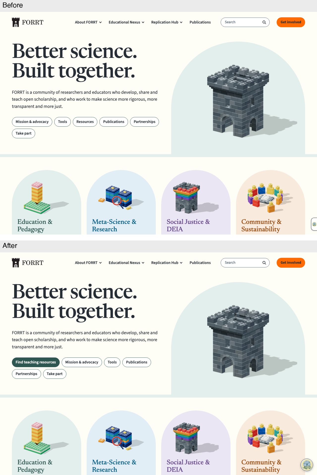
Desktop, first screen
A filled "Find teaching resources" button now leads the hero links and replaces the outlined "Resources" link. The chat launcher changes from a tab on the right edge to a round JUST-OS button in the corner.
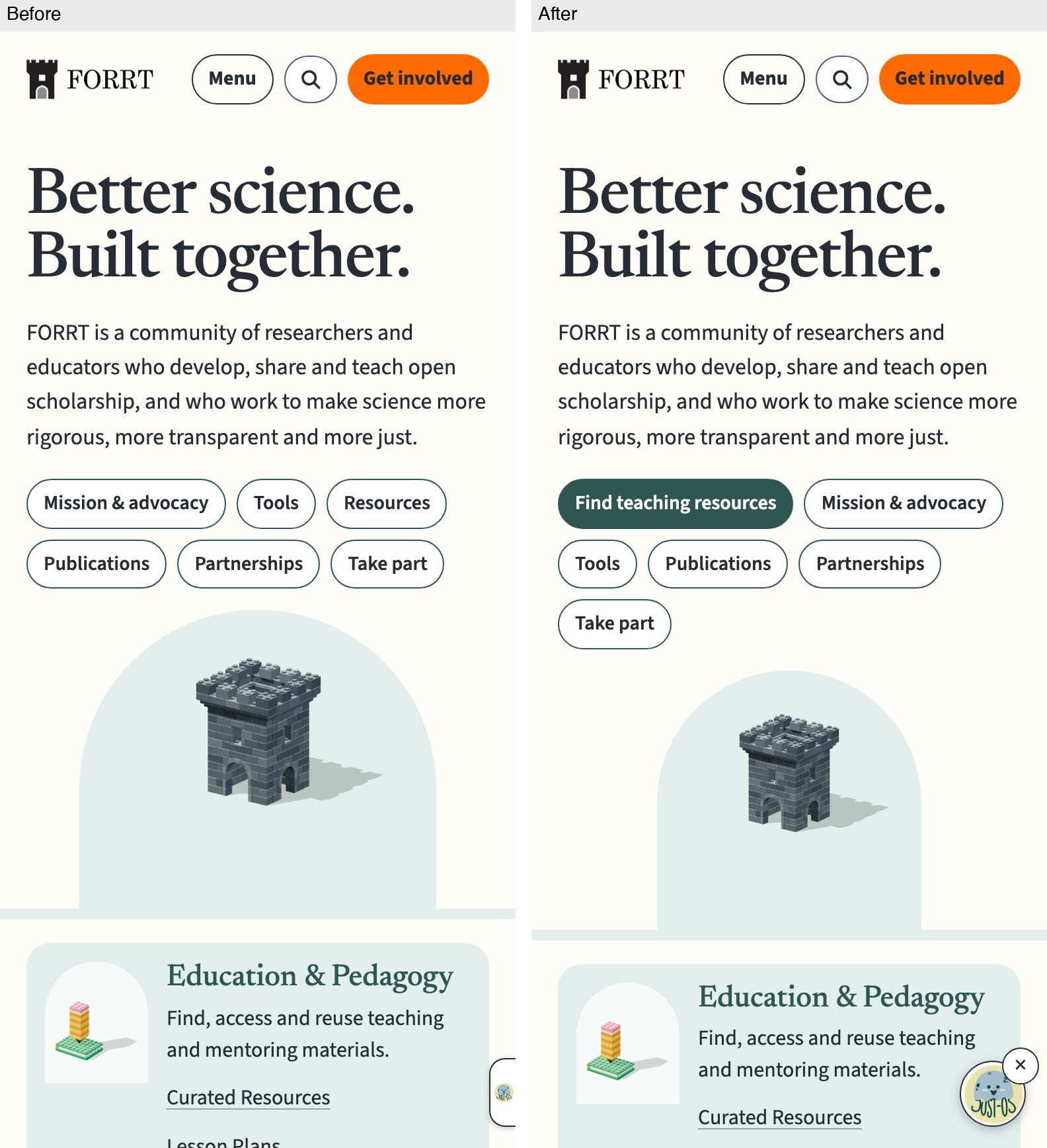
Phone, first screen
On a phone the hero links also start with a filled "Find teaching resources" button in place of "Resources"; the tower illustration below them is smaller; the chat launcher becomes a round JUST-OS button with a close (×) control.
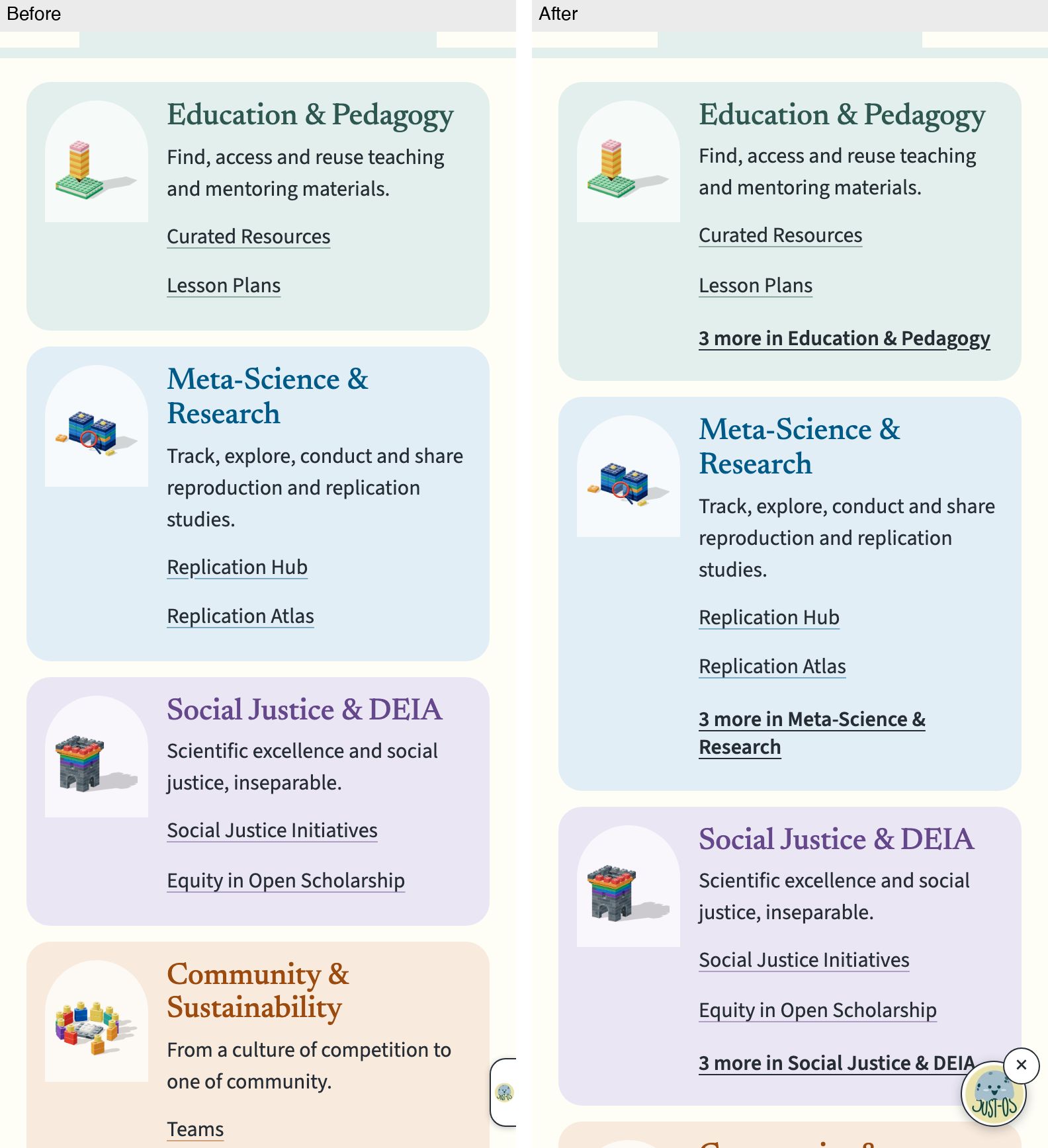
Phone pillars
Each area card on a phone ends with a link naming its area and the number of hidden links, such as "3 more in Education & Pedagogy"; before, only the first two links showed.
Resources
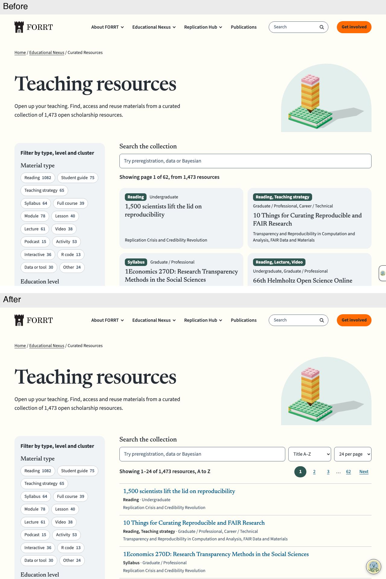
Desktop, first screen
Sort (Title A–Z) and page-size (24 per page) menus now sit beside the search box; results read "Showing 1–24 of 1,473 resources, A to Z" with page links at the top; resources show as a single-column list instead of two-column cards.
Phone, first screen
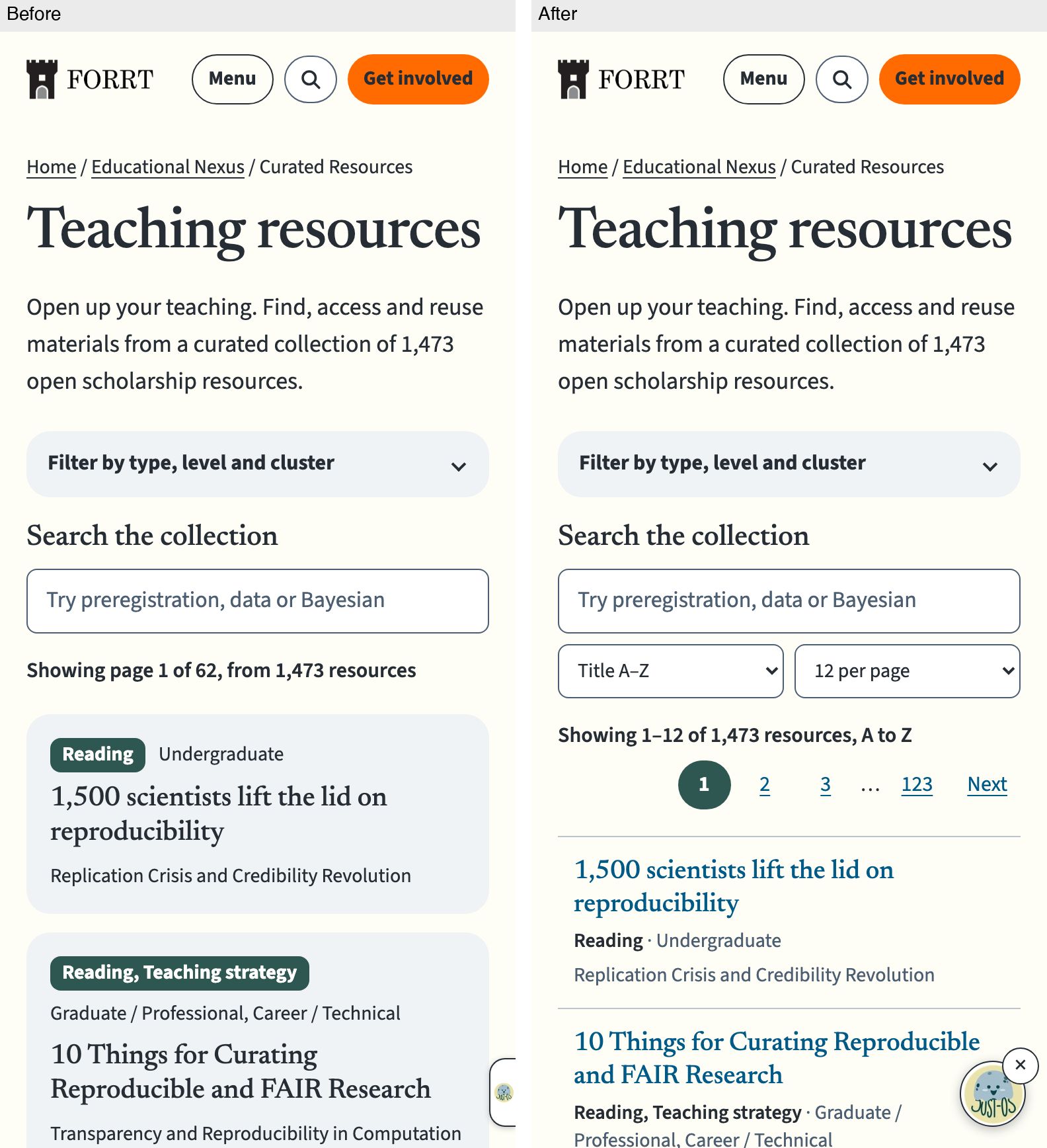
On a phone the sort and page-size menus sit under the search box, defaulting to 12 per page; the result line gives the range (1–12 of 1,473) with page links below it; resources are list rows instead of cards.
Tags
Desktop, first screen
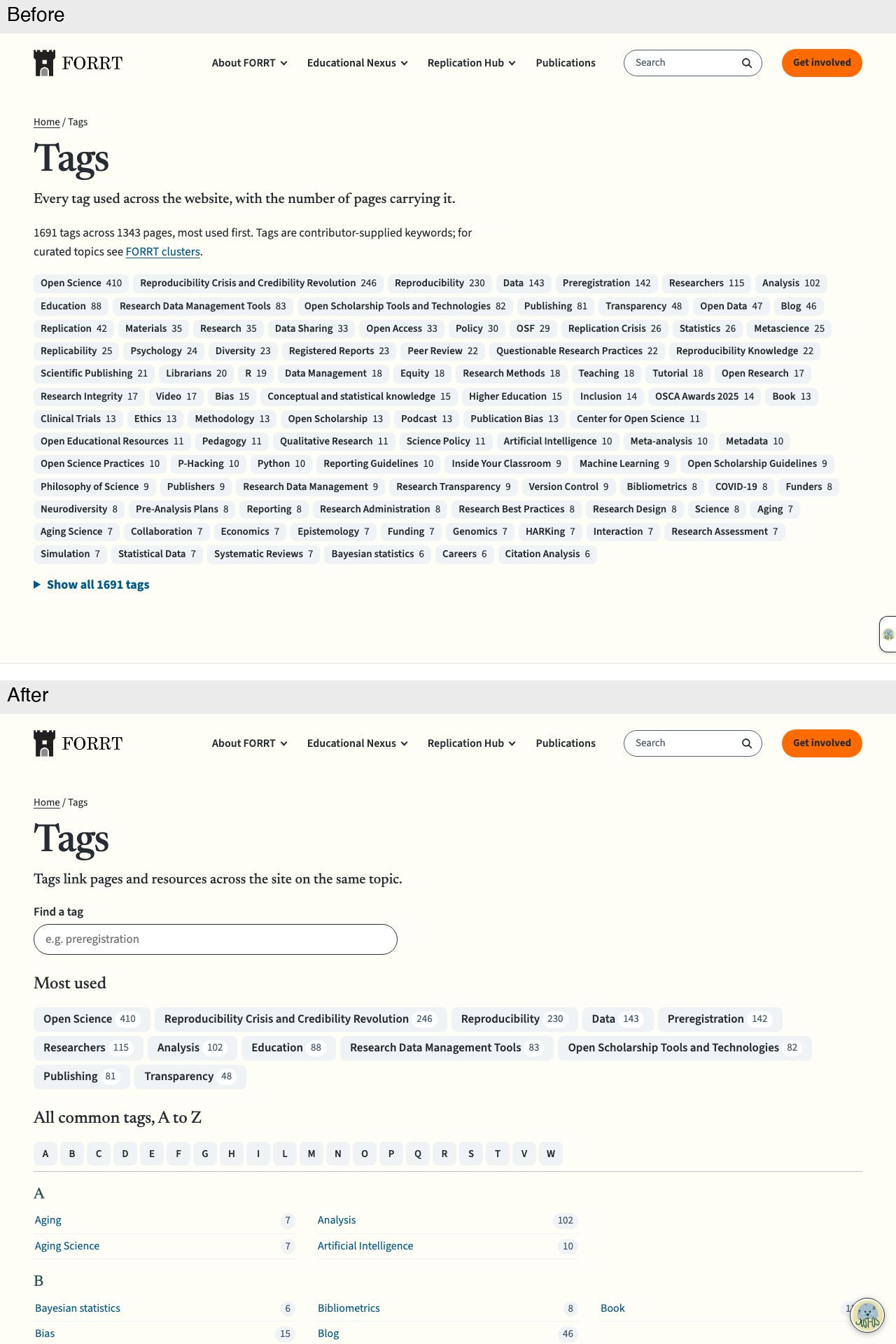
The page now lists only the 148 tags used on five or more pages, not all 1,691. A "Find a tag" search, a short "Most used" group and an A to Z letter bar with rows and counts replace the single block of tag chips.
Phone, first screen
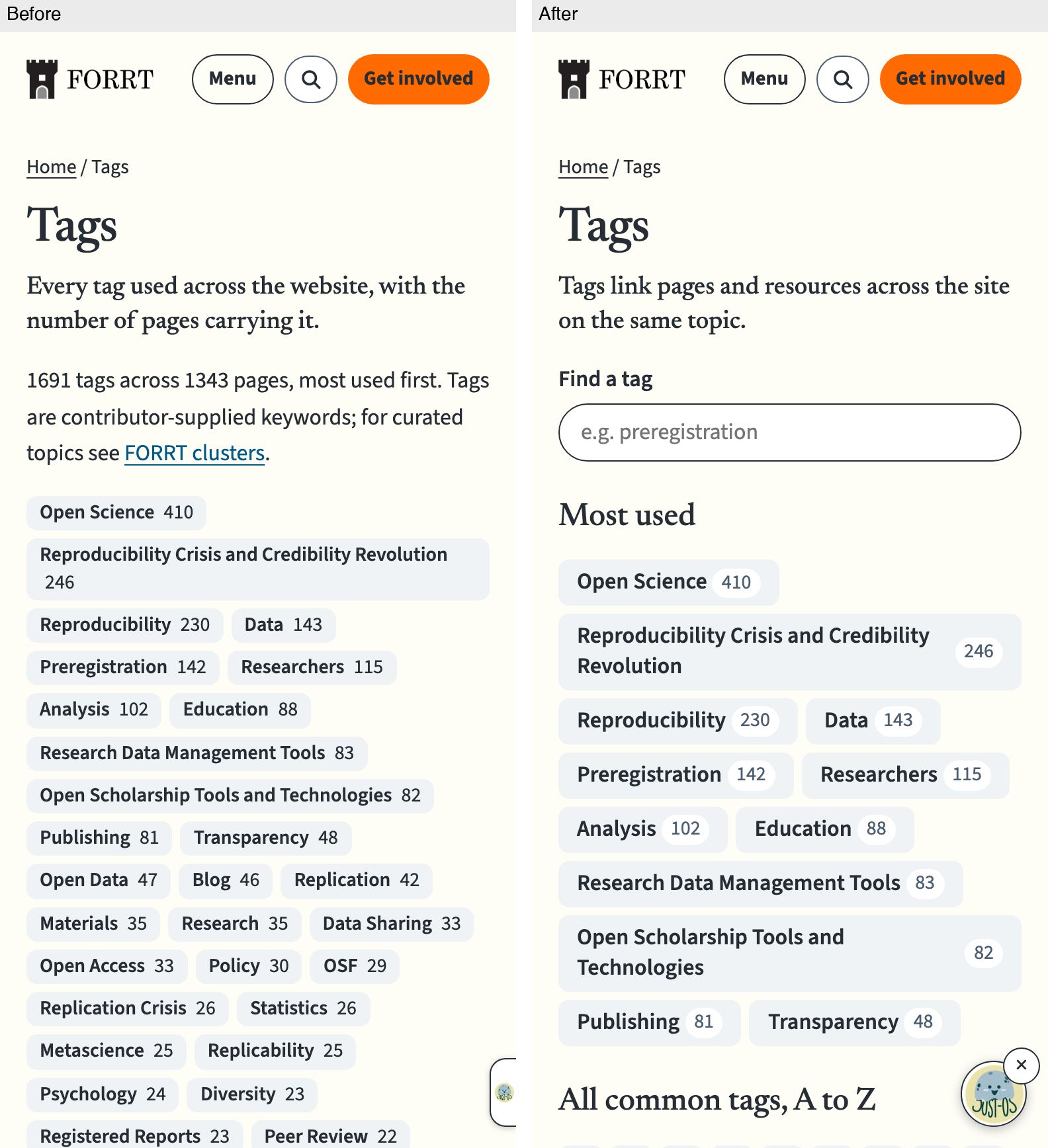
On a phone, a one-sentence description, a "Find a tag" search and a "Most used" heading now come before the tags, and counts sit in small badges.
Desktop list
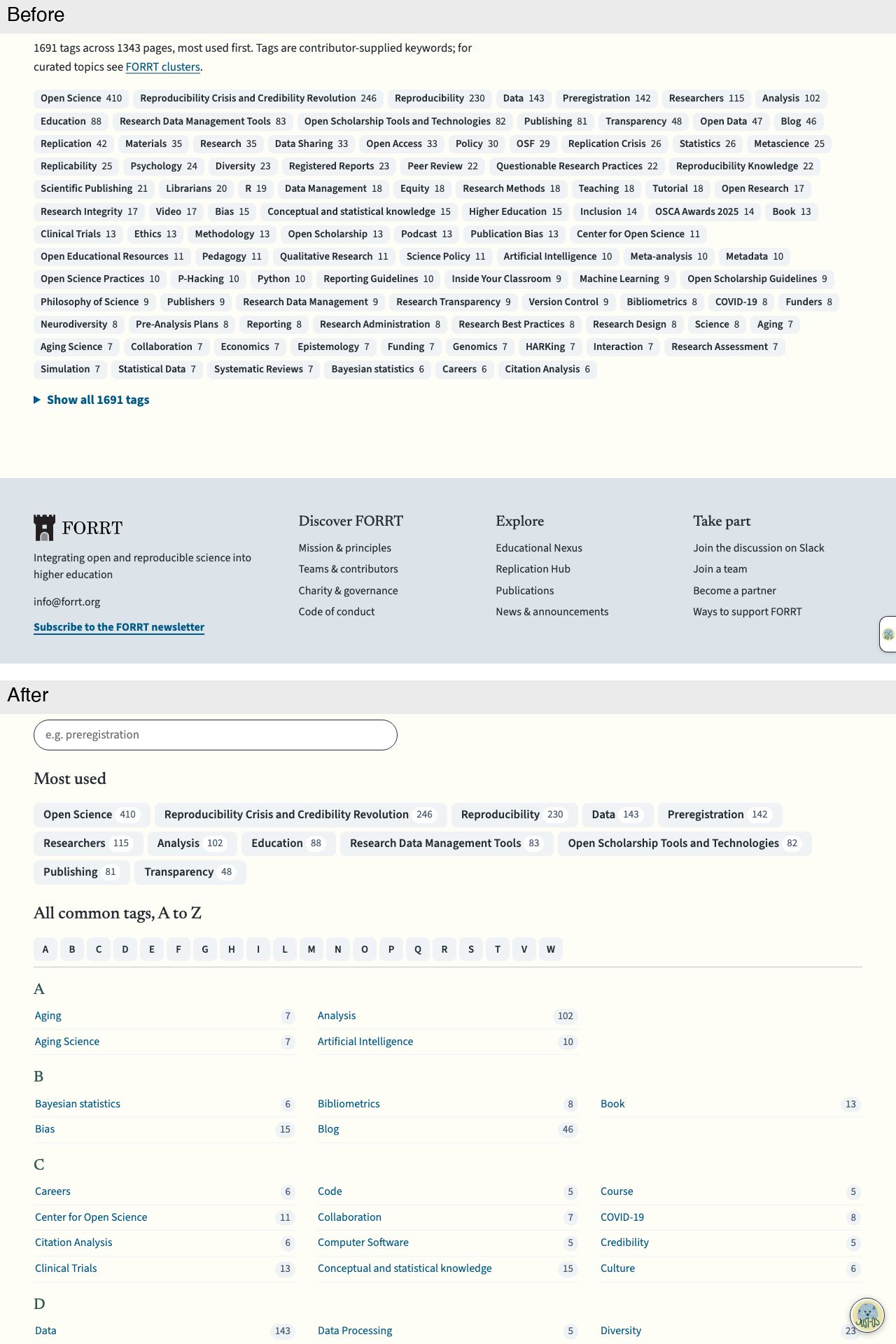
The long chip block and "Show all 1691 tags" link give way to an "All common tags, A to Z" section: a letter jump bar, then each letter's tags in three columns with counts on the right.
Phone list
On a phone the full chip list is replaced by twelve most-used tags, then letter buttons and the A to Z list in two columns with count badges.

AWoP
Desktop, first screen
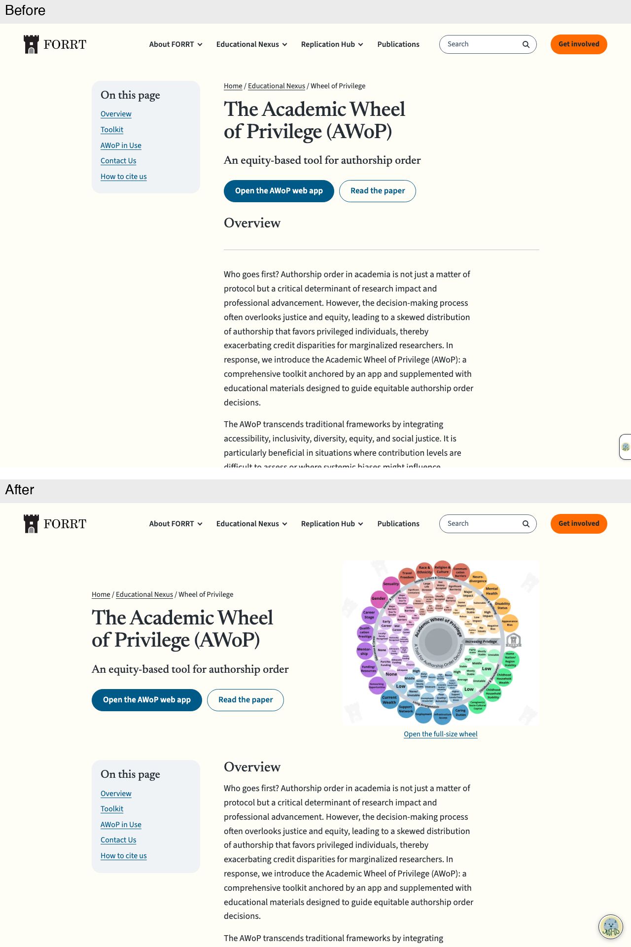
The wheel image now sits beside the title, subtitle and buttons in the page opening, with an "Open the full-size wheel" link. The "On this page" card moves down beside the Overview, which loses its divider rule.
Phone, first screen
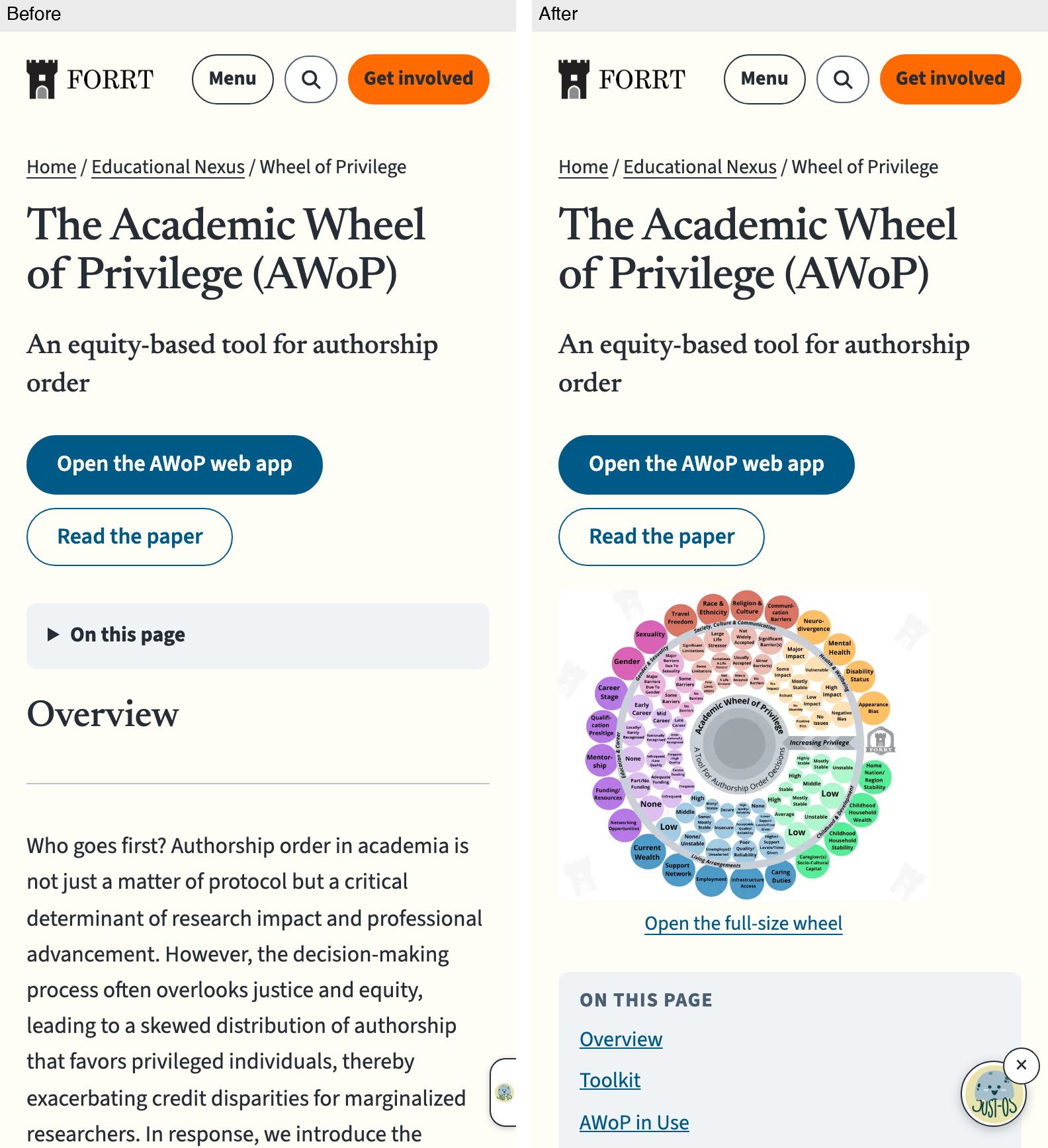
On a phone the wheel appears straight after the two buttons, with an "Open the full-size wheel" link; the collapsed "On this page" toggle becomes an open "On this page" list.
Desktop toolkit
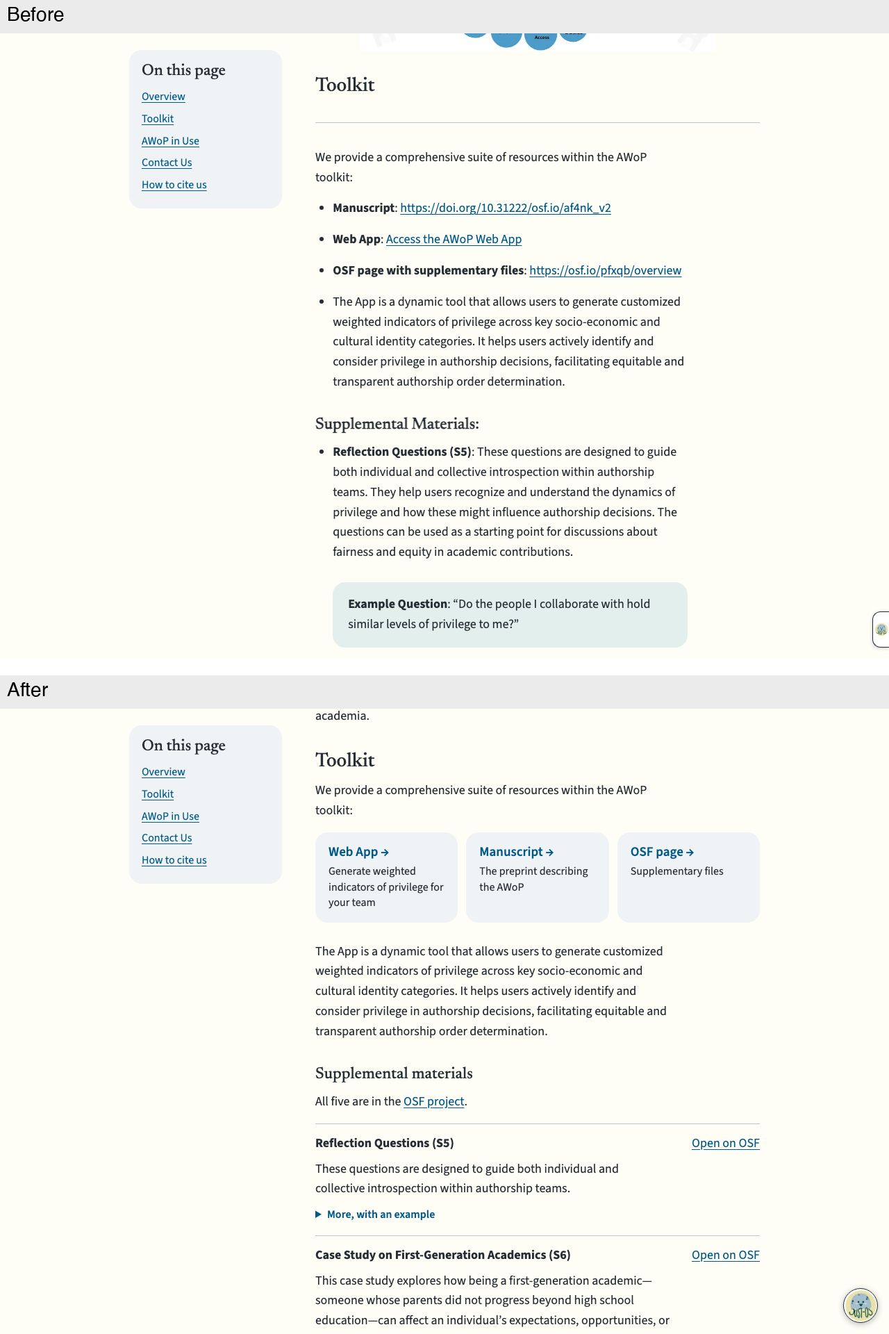
The Toolkit's three bulleted links become cards (Web App, Manuscript, OSF page) with one-line descriptions. Supplemental materials become rows, each with an "Open on OSF" link, a shorter description and a "More, with an example" toggle.
AI in Metascience
Desktop, first screen
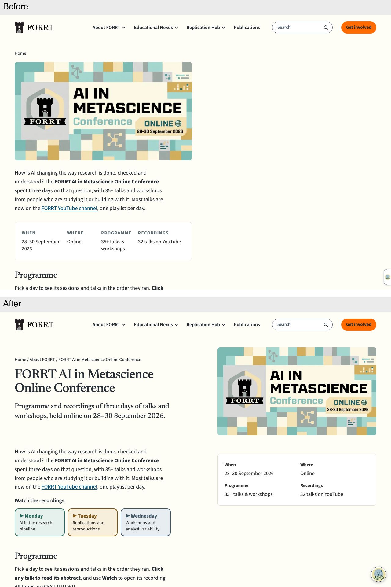
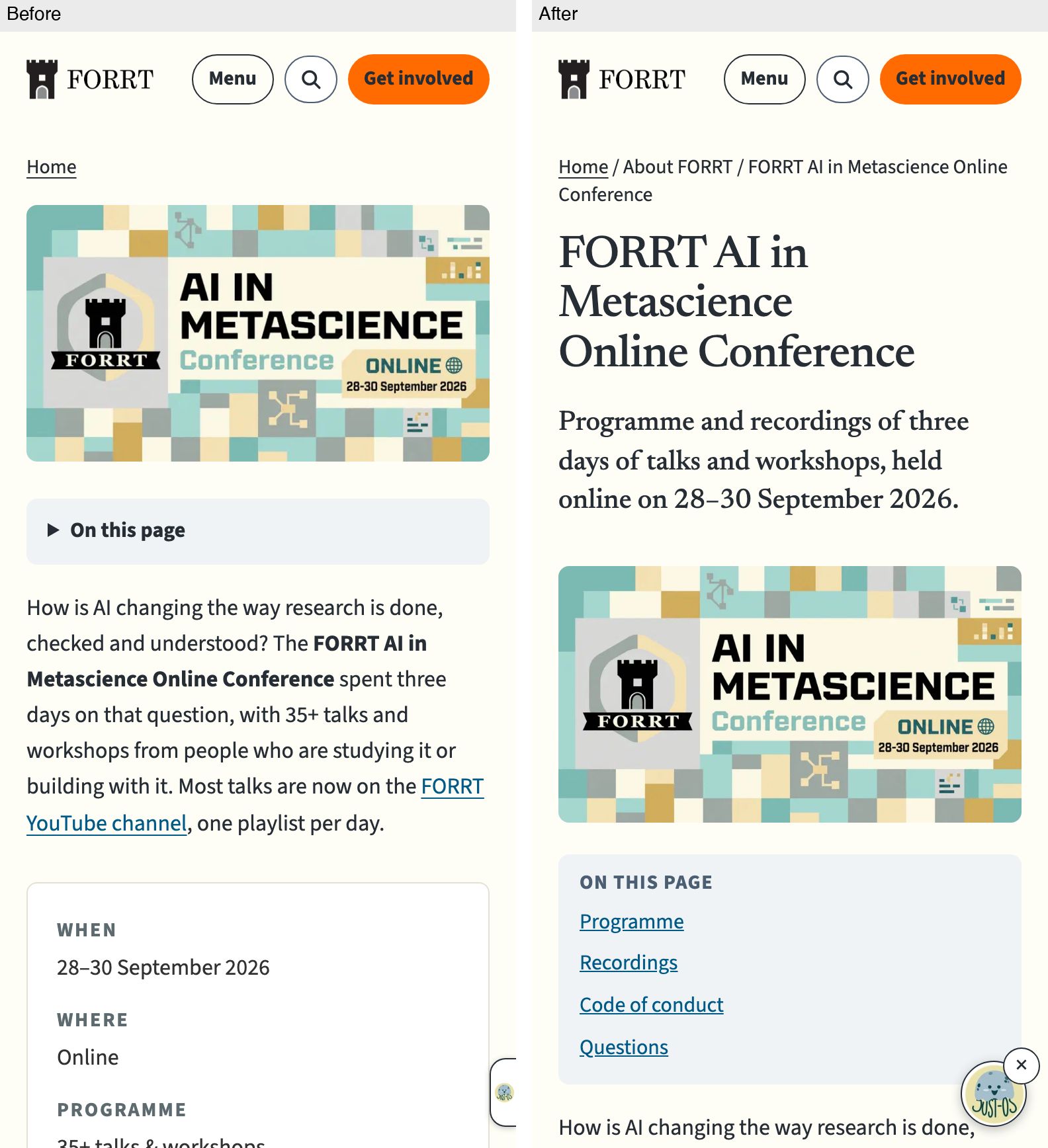
The page gains a proper title, subtitle and fuller breadcrumb, with the banner moved to the right and the When/Where/Programme/Recordings facts in a two-by-two box beneath it. Three day-coloured playlist tiles under "Watch the recordings" appear above the programme.
Phone, first screen
On a phone the title and subtitle now come before the banner, the breadcrumb gains "About FORRT", and the collapsed "On this page" toggle becomes an open list of four sections.
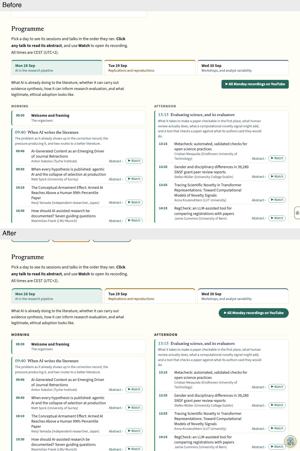
Desktop programme
Little change in the programme itself: the YouTube button is fully rounded. The bottoms of the new playlist tiles are visible at the top.
Reversals
Desktop, first screen
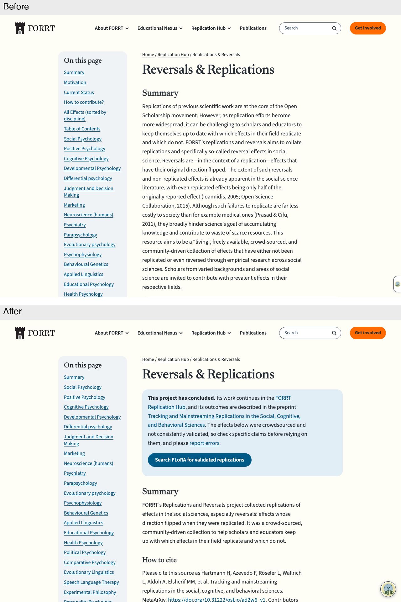
A "This project has concluded" box with a "Find more replications in FLoRA" button now opens the page. The Summary is one short paragraph, followed by "How to cite"; motivation, history and contributing move into a collapsed "About this project" section.
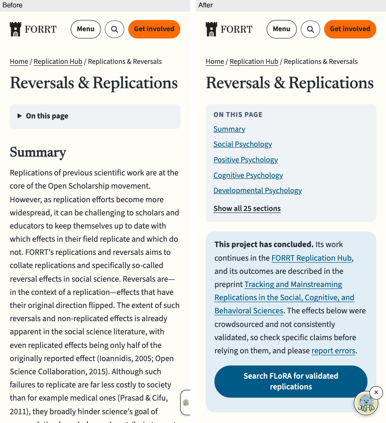
Phone, first screen
On a phone the collapsed "On this page" toggle becomes an open list of five sections with "Show all 25 sections". The concluded-project box with its FLoRA button follows, before the shortened Summary.
Desktop list
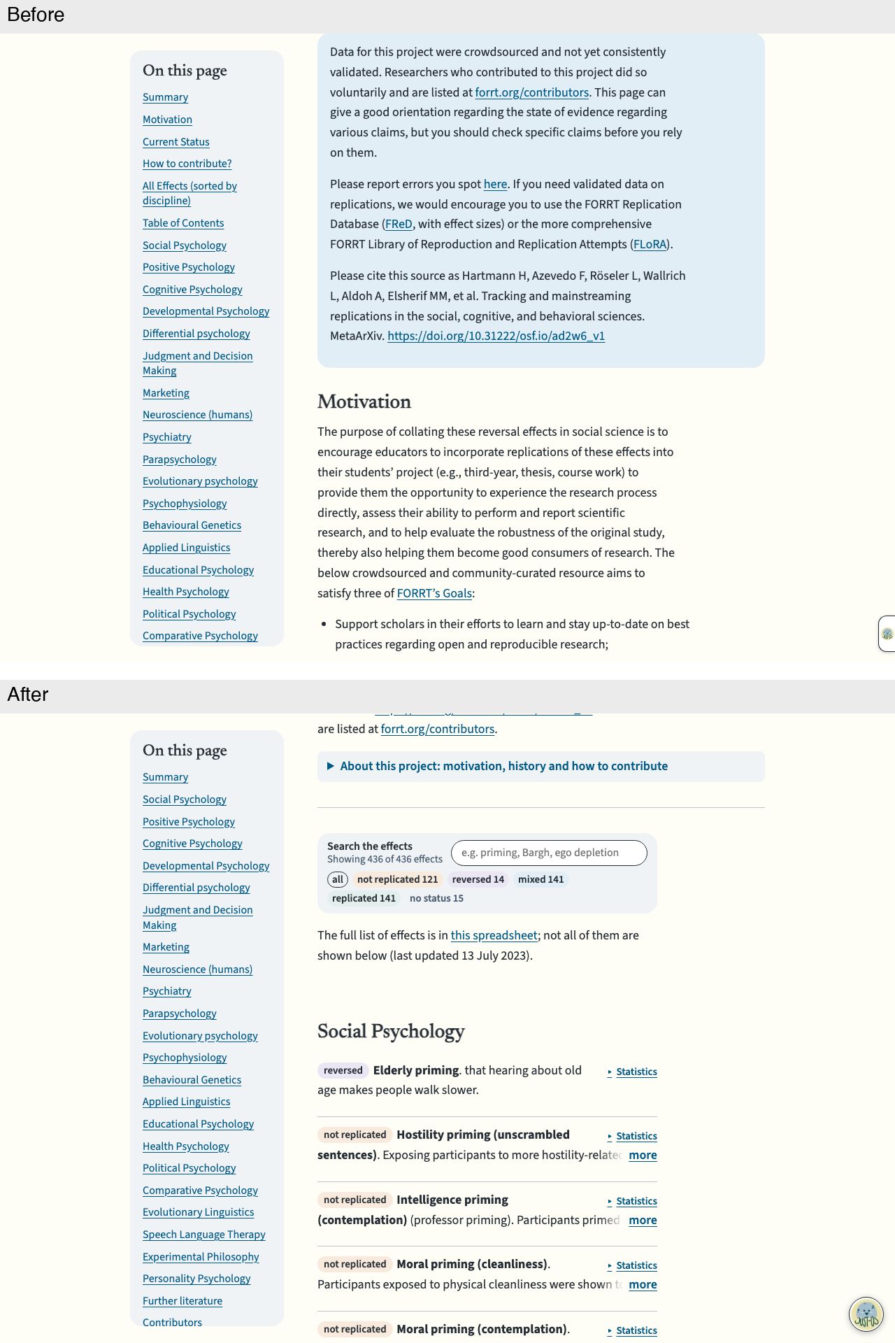
The effects list now starts right after the intro, under a search box, live count (436 of 436) and outcome filter chips. Each effect is a row with a status chip, a "Statistics" toggle and a two-line description with a "more" button.
Phone list
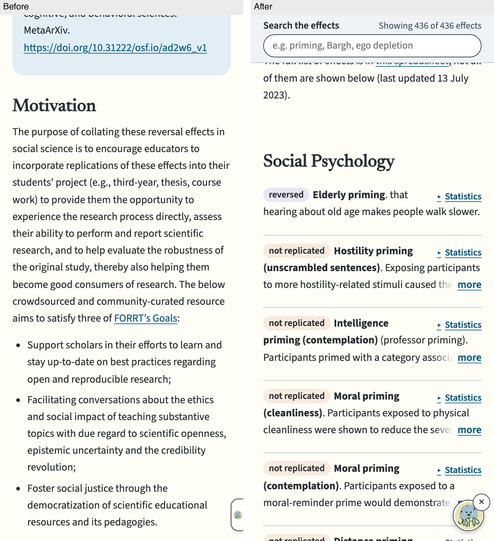
On a phone, a "Search the effects" bar with the live count stays pinned at the top while effects scroll. Each effect has a status chip, a "Statistics" toggle and a two-line description with "more"; before, this scroll position was still in the Motivation text.
Replication Hub
Desktop, first screen
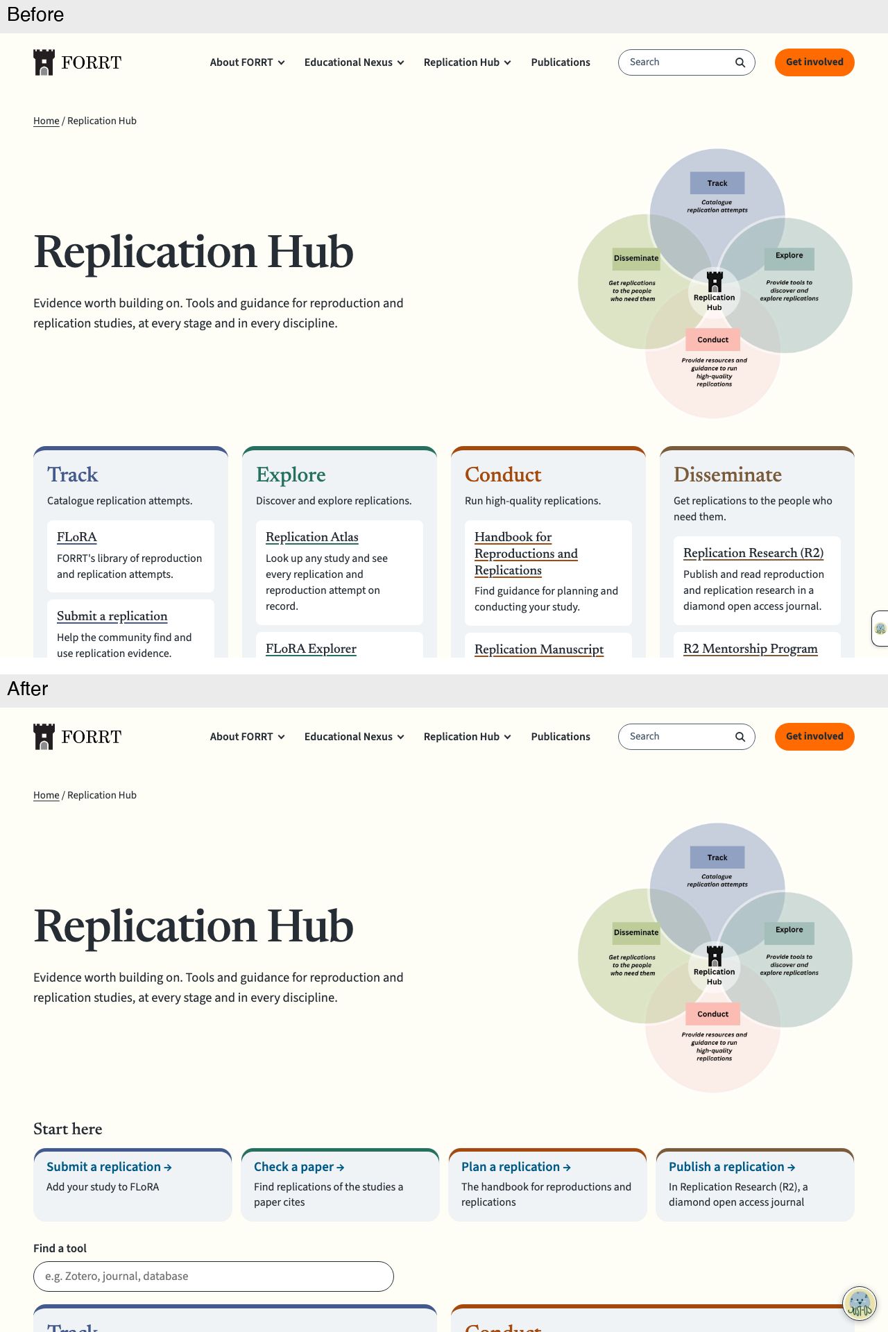
The Venn diagram stays beside the title and lede. A "Start here" row of four task cards (submit, check, plan, publish) and a "Find a tool" search now come before the stages, which are two wide columns instead of four narrow ones.
Phone, first screen
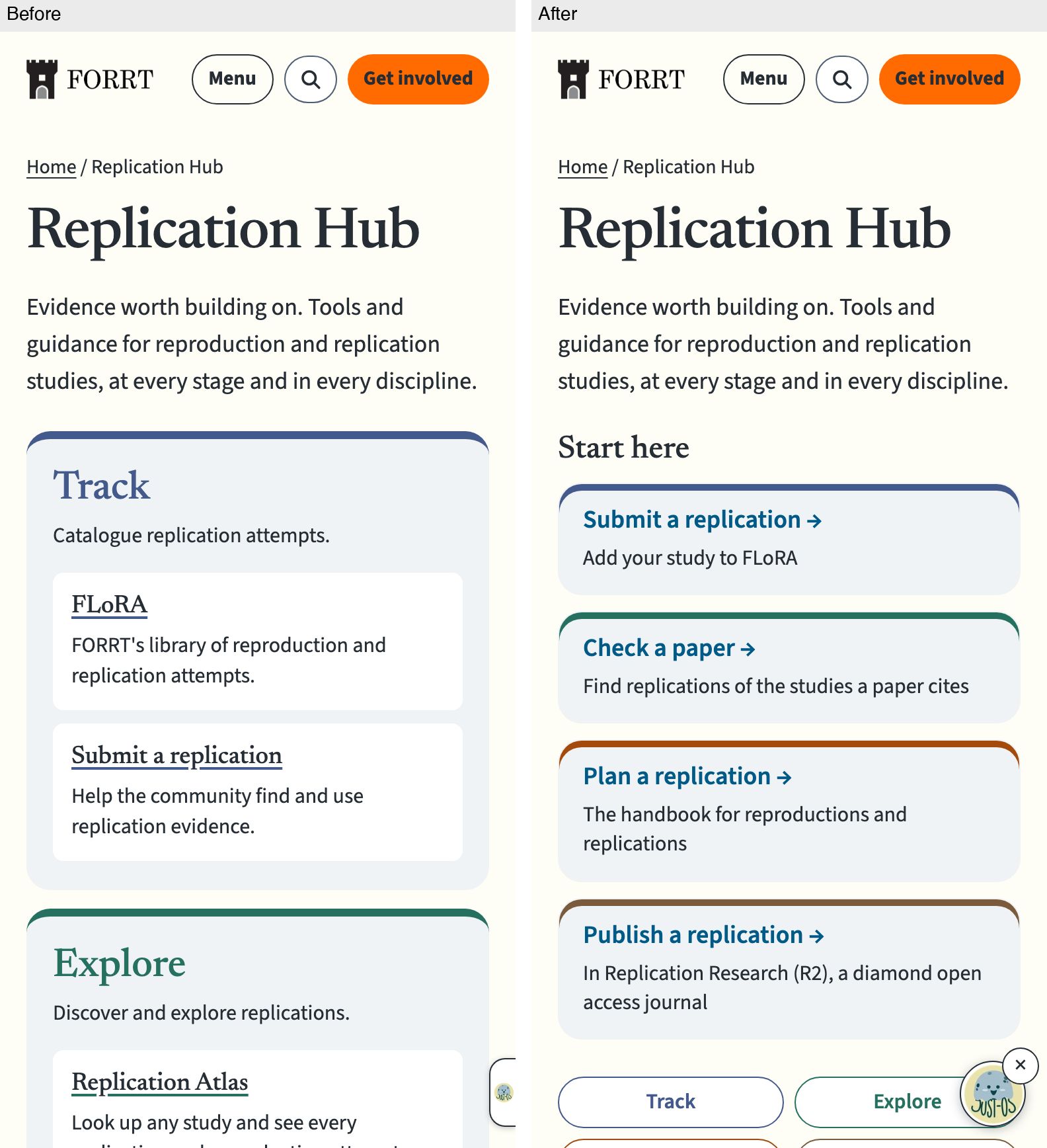
On a phone, four "Start here" task cards in the stage colours now come before the stages, followed by Track/Explore/Conduct/Disseminate jump buttons in two rows of two, instead of opening straight on the Track list.
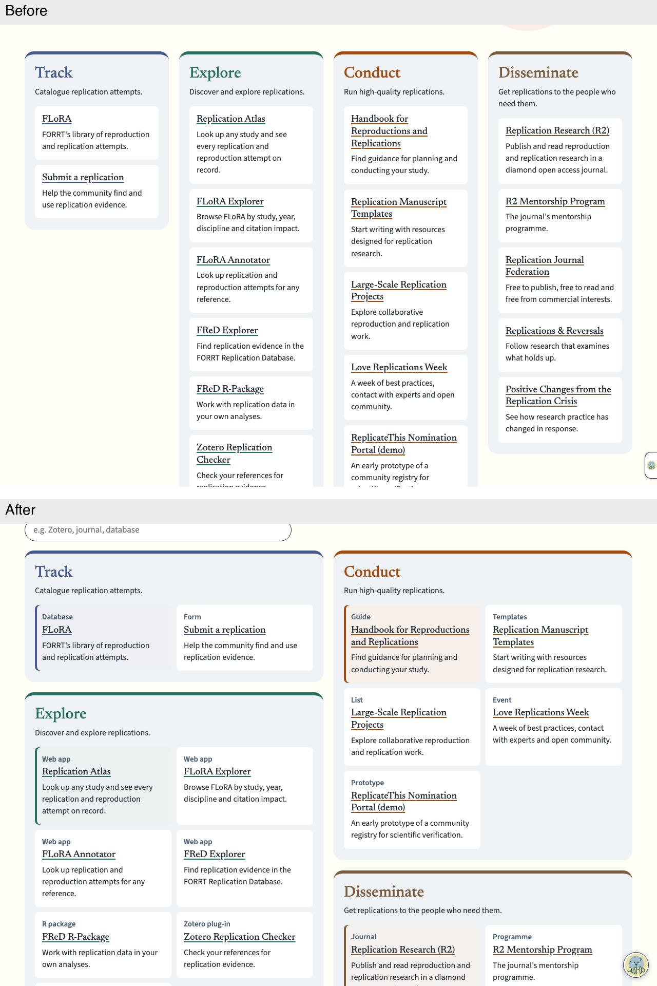
Desktop stages
The four narrow stage columns become two columns (Track and Explore on the left, Conduct and Disseminate on the right), each with tools in a two-by-two grid. Every tool now carries a type label such as Database, Web app, Guide or Journal.
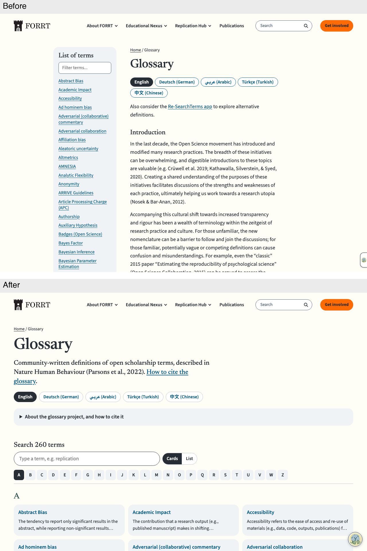
Glossary hub
Desktop, first screen
The term sidebar gives way to a full-width hub: language buttons, the introduction and history under "About the glossary project, and how to cite it", a "Search 260 terms" box with a Cards/List switch, an A to Z bar and term cards.
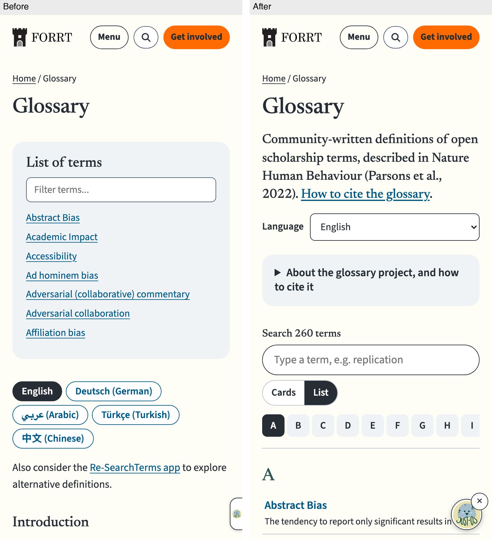
Phone, first screen
On a phone, a labelled Language menu replaces the language buttons; the introduction sits under "About the glossary project", then a "Search 260 terms" box, a Cards/List switch (List selected), letter buttons and term rows.
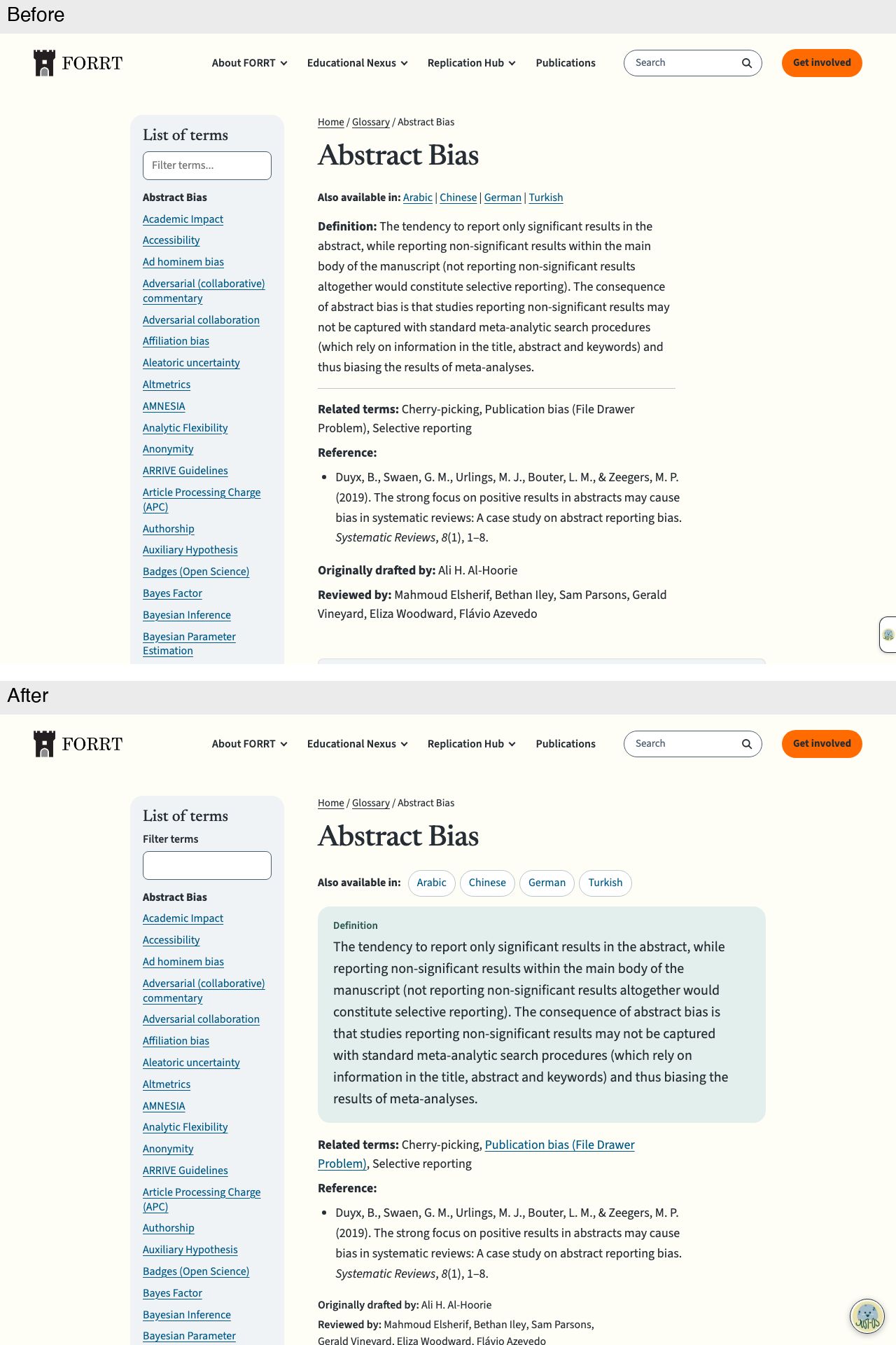
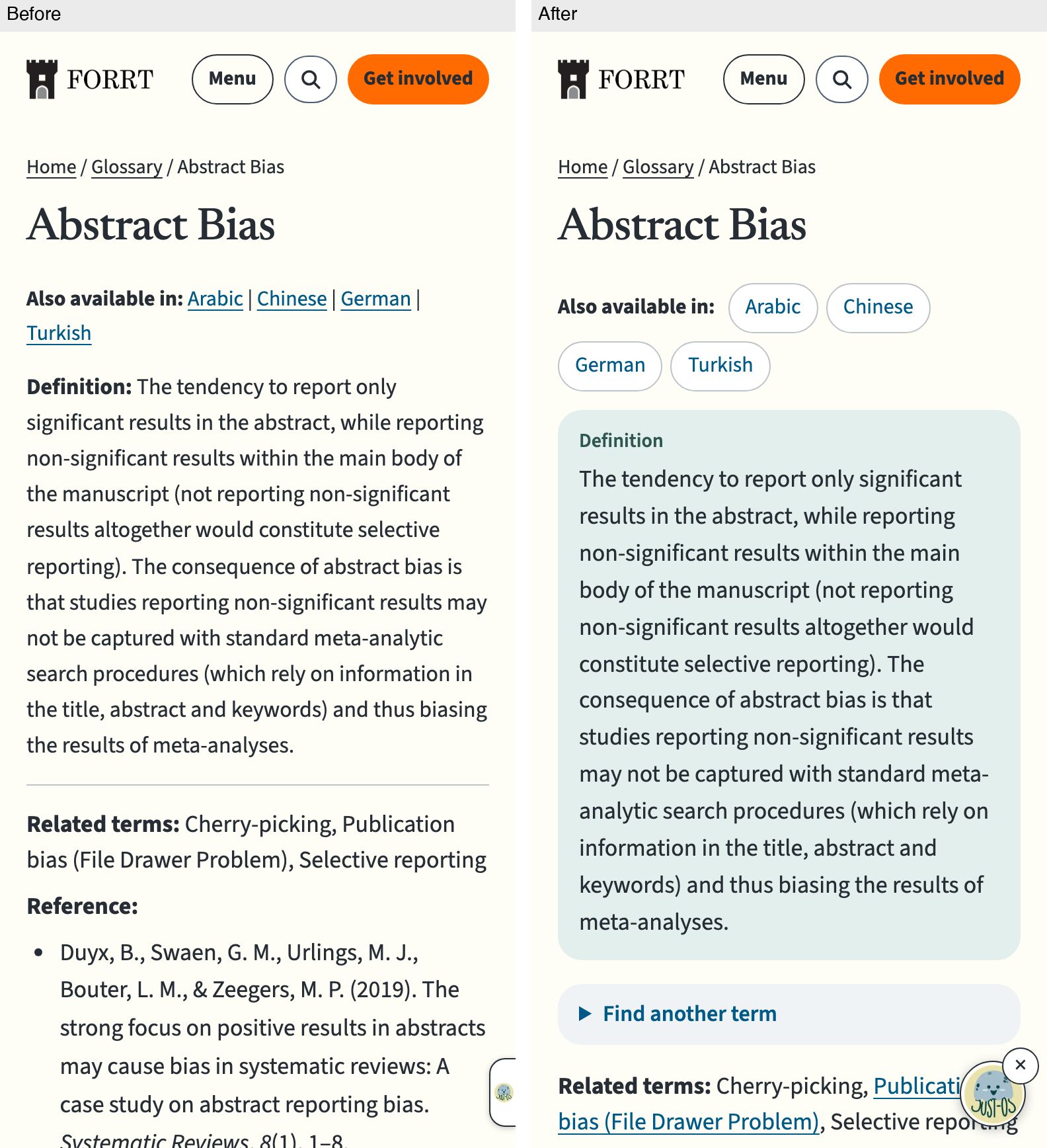
Glossary term (Abstract bias)
Desktop, first screen
The definition sits in a tinted panel at a larger size, under a small "Definition" label. The other languages are outlined buttons instead of pipe-separated links; related terms stay a plain list, with linked ones underlined.
Phone, first screen
On a phone, the language links become buttons and the definition moves into a tinted panel; a collapsed "Find another term" control now follows the definition, then the related terms as a plain list.
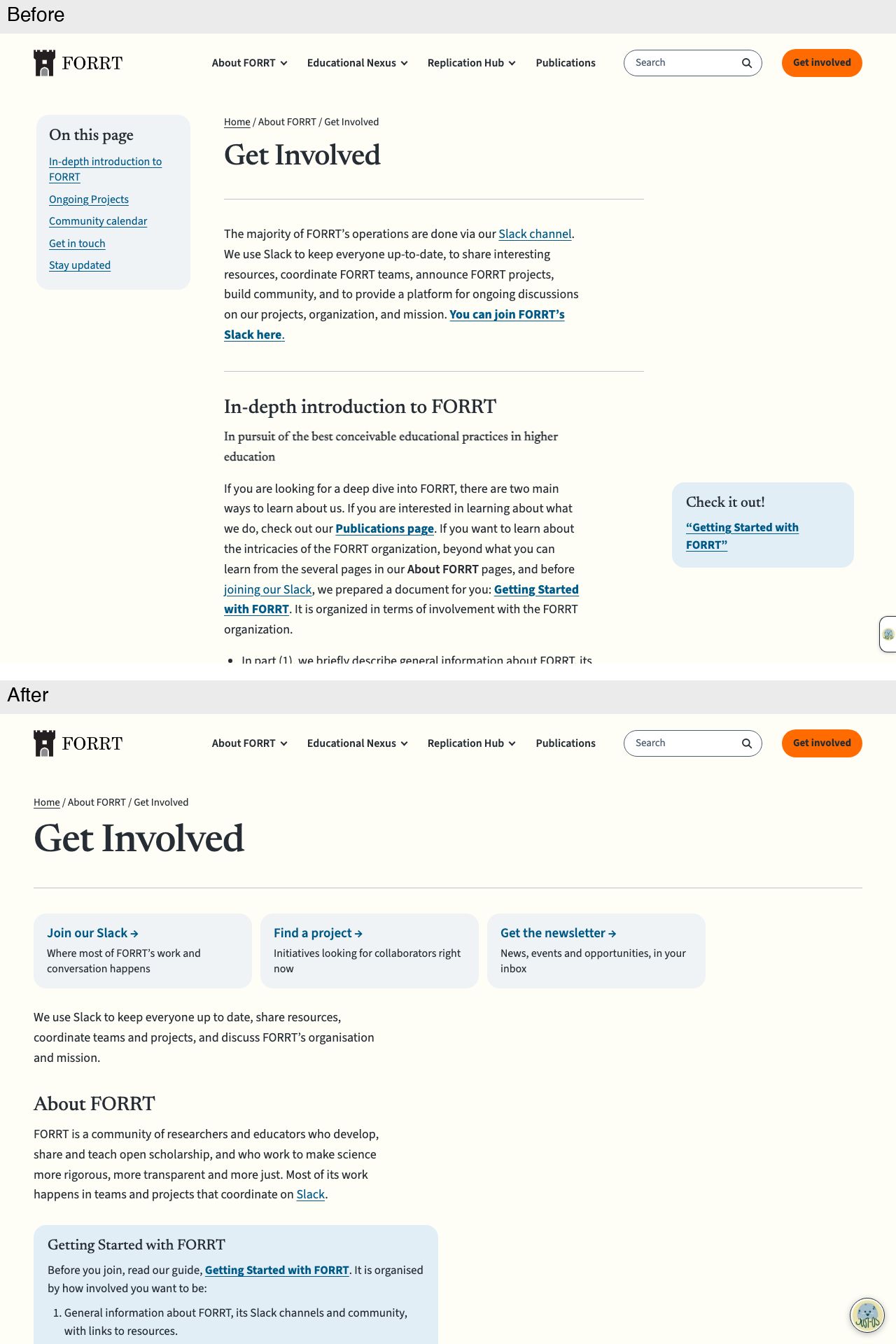
Get Involved
Desktop, first screen
The page uses the full width, without the "On this page" sidebar. Three action cards (Join our Slack, Find a project, Get the newsletter) replace the long Slack paragraph; a short "About FORRT" section with the Getting Started guide now comes before Ongoing Projects.
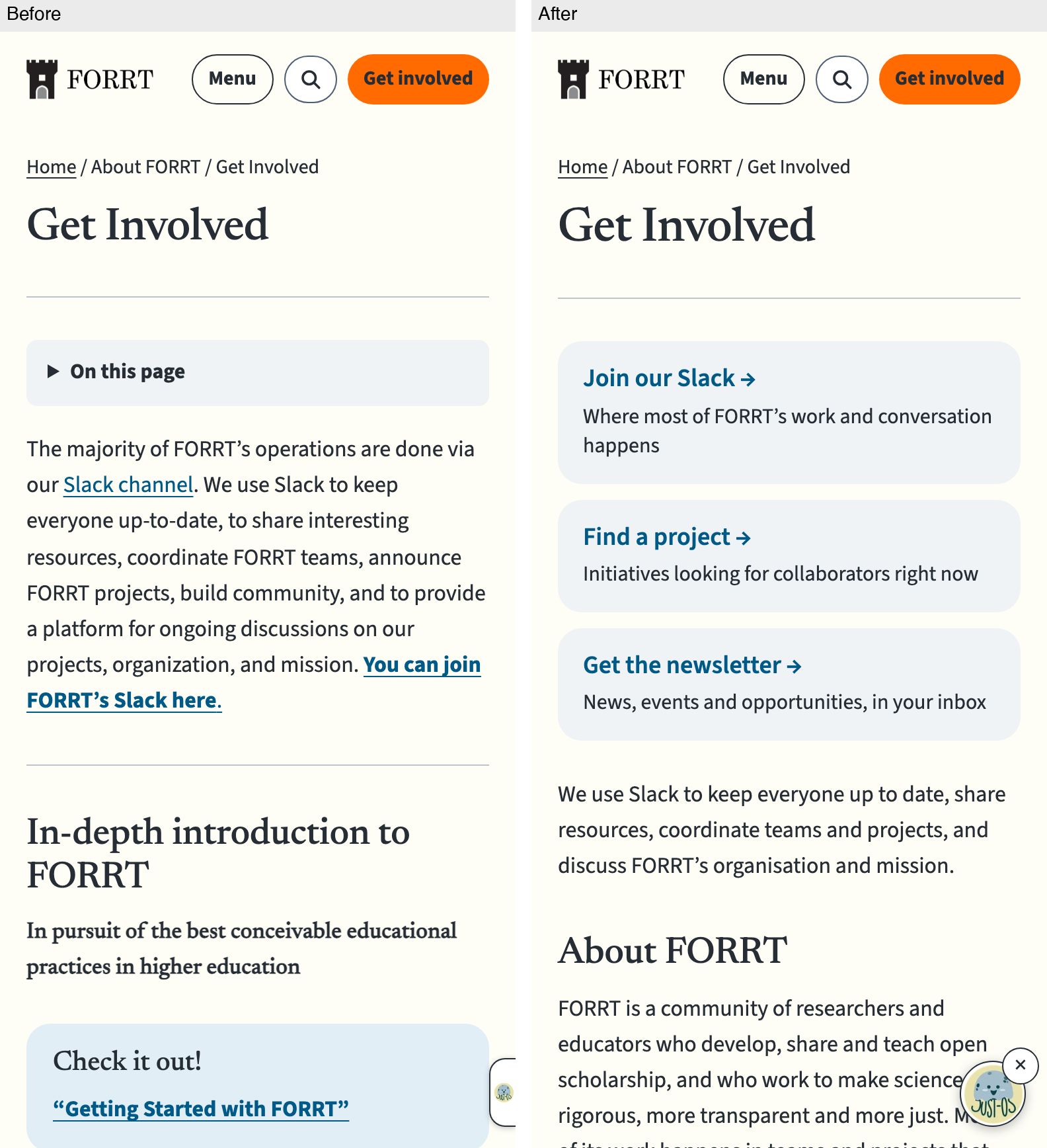
Phone, first screen
On a phone, the three action cards replace the collapsed "On this page" toggle and the long Slack paragraph; a short "About FORRT" section, with the Getting Started guide and links to the details, follows before Ongoing Projects.
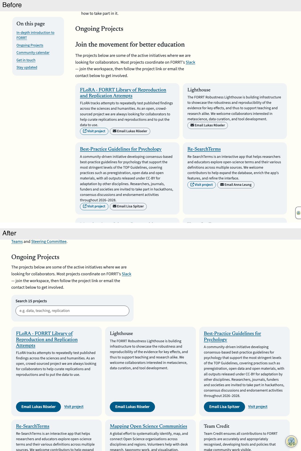
Desktop projects
Projects are three to a row across the full width, under a new "Search 15 projects" box; the "Join the movement" subheading is gone. Each card ends with a filled "Email …" button and a plain "Visit project" link instead of two small outlined buttons.
Created with Claude Opus 5.5 in Claude Code; reviews by GPT-6.1 Sol (Codex), Claude Opus 5.5 and Gemini Argon (Antigravity).
🤖 Generated with Claude Code